


As a kid, I had what I thought of as two epic walks that I could take. The less frequent one was by far the longer of the two, although it never felt as such to me when I kitted myself out with a mini-frame backpack and set off into the woods behind our house for a two mile romp, pretending I was Michael Douglas in Romancing the Stone come upon the latest jungle, with a baseball bat-like piece of wood wrapped in hockey tape at the base for a grip serving as my extemporized machete. I was not the coolest kid. But it was my other epic walk, which couldn’t have been more than a fifth of a mile, that always felt like the more Lewis and Clark-worthy trip, with so much of my future happiness — for that particular day, at least — hanging in the balance of what was going to go down at the tiny mom-and-pop store whose entire business was in supplying the people of our development with soda, beer, chips, ice cream, the odd bottle of glue, and — for us kids, anyway — baseball cards.
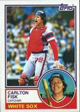
The store seemed leagues away, almost an impossible journey, save that I had made it enough times in the past to know that perseverance would get me there, with maybe a grape juice pack stuck in my pocket for refreshment just in case. The reason for my skewed sense of distance, I now realize, was because I flat out could not wait to get to that store, plunk down my thirty-five cents on the counter (and there is no one I wouldn’t hit up for thirty-five cents; great aunts were particularly susceptible, I came to learn, and you could try to curry their favor several times a day when they were visiting) in hopes of landing, say, something like an ’83 Carlton Fisk Topps card, Fisk being my favorite player, and the design being a clean, well-flowing one — with just enough action in it — as I had discovered when a friend unearthed the card from one Reggie Jackson in mighty-follow-through mode. Never mind that all of us New England kids — well, discounting Connecticut kids, I suppose — were raised to hate Jackson.
I was like everyone else in my neighborhood in this regard. Anyone pro-Yaz had to be anti-Reggie. In theory, anyway. But I was a little different, for I was somewhat of a baseball card aesthete. I would luxuriate in the designs of each annual set, caring, at the time, only for Topps, as they had such a storied history, and thinking little of Donruss and Fleer (nothing was tackier than Fleer, for God’s sake), whose packs were also on sale at the little mom-and-pop shop, although you had to have something wrong with you — or just wanted to be a contrarian — if that’s where your thirty-five cents went. There was no getting around it: anything but Topps, in the world of a burgeoning card buff (one who was unaware of the rich pre-Topps history of cards) was a “jip,” and there wasn’t a lot worse than that in the world of an eight-year-old.
Kids would flip the cards, trade the cards, sometimes try to sell the cards, barter for recently caught pet frogs and turtles from those aforesaid Romancing the Stone woods with the cards. But I’m not sure anyone else studied the cards. I couldn’t stop studying them. I’d note their visual architecture, how each year’s new set would compel the eye to move in a different manner across the plane of an ostensibly humble cardboard slab than the previous year’s set had. I got so into all of this that I’d go to the library, storm past the perpetually assembled group of Reading Is Fundamental kids that were trying to decide what they’d like to check out, a harried librarian attempting to meet their demands, and pull out this massive tome that had a photo of every card Topps had put out since the company began releasing baseball cards in 1951.
I all but slathered that book in drool. It was technically a reference book, so you couldn’t take it home, but man, I thought, what a neat idea — some adult thought baseball cards were important enough to get their very own reference book, like ancient coins got theirs, and post-Impressionist painters had theirs. I told my dad that I thought baseball cards were a form of art. Or could be. Or sometimes were. Or maybe I’d understand that they were some day. And what did he think? “Van Gogh made very small sketches about the size of a baseball card when he’d write to his brother.”
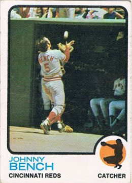
Excellent, I thought. That probably counted for something. I was worried that the small size might be this uber-hurdle to qualifying as official art. So what if it was maybe just one adult ever who thought baseball cards warranted the reference book treatment. I knew, some day, that with my help — that is, in getting older — there’d at least be two of us. And you no more bartered something like a glorious 1973 Topps Johnny Bench — a pictorial distillation of a catcher’s leonine, balletic grace — for your buddy’s recently landed garter snake named Hank than you ever put a Reggie Jackson card at the top of your card pile where a Red Sox legend like Jim Rice more properly belonged.
Actually, that wasn’t quite true, for me. I’d rate — and store — my cards in order of their aesthetic appeal, much as I’d later daily roam the corridors of the Museum of Fine Arts in Boston, arguing with myself as to what Fitz Henry Lane canvas was the most visually successful, or with what skill Motherwell could make one’s eye journey around a canvas such that you felt the simple elegance of the Monorail had been crossed with Abstract Expressionism, a largess of minimalism in a maximalist world.
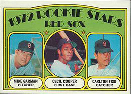
That’s how I liked my baseball cards. As a result, I didn’t care for a number of 1970s sets, like the disco-y ’75 issue, which was still a triumph compared to the ’72 set. This was problematic for me, as that was the year of Fisk’s rookie card, a card I came to acquire at a curio shop somewhere not far from Story Land on a summer vacation. I wanted to like Fisk’s rookie card — visually, that is — more than I did. But I’d just sit there with it in its pathetic plastic sleeve (a transportable frame for protection, of course) on the floor of my closet, the place of my own private museum, trying to believe the thing didn’t look like part of the set decoration from a Brady Bunch episode, but, alas, it did.
But there was no shortage of classic set designs from Topps’ back catalog. The ’71 set, with its black enameled borders and sharp, deep-focus photography, took the palm as far as the 1970s went. The ’67 set was all liquid color, almost like the cards had originated from a series of watercolors that had crystallized inside a camera’s aperture ring. The 1950s was stacked in terms of all-time great sets, and the pull back to that decade is a strong one for collectors. I remember going to MoMA when I was a teenager, and being heartened to see baseball cards on display there, with lots of samples from the 1950s, as if there was some vanguard curator whose pictorial obsessions dovetailed with my own.
Granted, the cards at MoMA were a representative slice of baseball card history, with no real attempt to say, in effect, “this is art, this is not, this is better art than this,” etc. which were the terms I came to understand I was thinking in. Of course, the further I went along in thinking these matters through, the more card sets I discovered, and, with that, the epiphany that while Topps was pretty cool, in the cards-as-art game, Topps was not by any means the company you’d exclusively turn to. But in looking at the top five card set designs of all time, we can begin with the company that started a lot of artistic mediations for me back when my mates were trying to pry Hank from his latest owner.
5. 1956 Topps
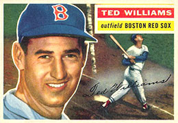
This was a big year in baseball card history. Topps had bought out it’s rival, Bowman. This meant, foremost for a lot of Baby Boomers, that Mickey Mantle, who had not made a Topps appearance since ’53 due to contractual obligations, would be returning and doing so in a design that is a triumph of cardboard-based trompe-l’oeil. The Mick’s card is an easy highlight, “aw-shucks” American wholesomeness in the visage at the foreground, which humanizes the athletic virtuosity of the background as the Yankees’ Triple Crown-winning outfielder gobbles up a would-be home run. There is a painterly finesse that runs throughout the set, with the colors having more of a soft, burnished, autumnal quality than with Topps’ 1955 product. So what if Hank Aaron’s card features Willie Mays in the action shot? For me, it adds a nice, quasi-dreamy affect, like when you’re mulling over who won a batting title or the MVP in a given year and names, stats, and legends start to conflate. And never has the purity of the left-handed swing been better visually encapsulated than in the set’s Ted Williams card. Never mind that it looks like he’s just popped one up to the second baseman; any painter from Rubens on down understands the difficulty of capturing torque, and in that regard 1956 background Williams (Mini-Williams?) could be a veritable model.
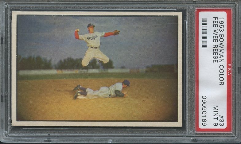
4. 1953 Bowman
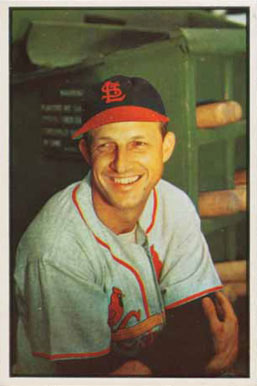
Bowman could be rather hit or miss. In ’55, they went with a TV-based design, because that’s when everyone was getting a TV and radio was being kicked out the door. I picture Ward Cleaver digging that design. The ’51 and ’52 sets used paintings, but it’s almost like they were done in marker, just these slabby, wettish-looking works that made you think they’d feel heavier than normal cards to hold. The ’54 set was pretty good, but there was no depth of field, with players occupying 80 or 90 percent of the composition. But none of this was a problem in ’53, when the art director at Bowman must have said something in essence of “screw this, we’re using deep-set photographs that will be so beautiful that we won’t even put any text on the front of the card.” This just wasn’t done, but Bowman in ’53 did it. I’d call this set out as the most poetic baseball card set that’s ever come out, as if Walker Evans was behind the camera, James Agee pissed off somewhere that he wasn’t given more to write. Stan Musial’s card is the most commonly cited favorite of his fans, but I’m not sure you can beat the sheer visual audacity — and brilliant end result — of Dodger shortstop Pee Wee Reese floating in air in the dead middle of the composition of his card, as if he were both ruler of this infield diamond and occasional resident of a world beyond it. Which is perhaps what it most feels like to overleap a hard-charging base runner at second.
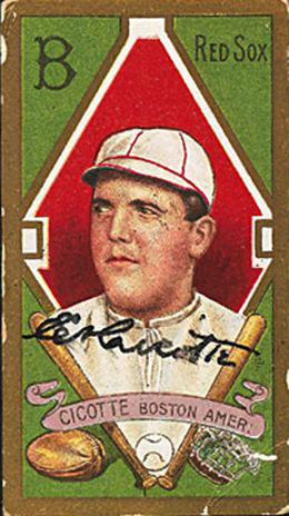
3. 1911 T205
Baseball cards got their start in the world when tobacco companies realized that the blank cardboard dividers and packing material in their product boxes could be better utilized with some emblazoned images. And so they went with girls and athletes. The so-called T206 set (there was a guy named Jefferson Burdick who wrote a book called The American Card Catalog which essentially created a sort of Dewey Decimal nomenclature system for tobacco cards) gets the majority of publicity thanks to its Honus Wagner card, the most valuable card of all. Do a web search on its history some time, and its various celeb owners and assorted scams that have dogged its legacy. Personally, I’d stump for 1911’s T205 set instead; I wonder if Topps, in ’71, with that obsidian-black border was stylistically playing off the orange-crossed-with-citrine gold that frames the T205 cards. Leprechauns would be fooled that something worth paying attention was going on here. The borders chip easily, but something like the T205 Tris Speaker is as a close as baseball cards have gotten to pocket-sizing a Caravaggio-esque spectrum of tonally balanced colors. There’s a very Victorian element as well, with the ladling of deep, bravely juxtaposed colors suggestive of that era’s richest Christmastime adverts.
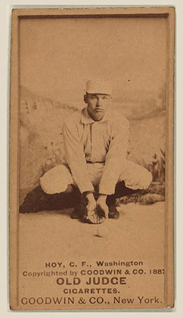
2. 1887-90 Old Judge
Amongst the earliest baseball card sets is Goodwin Company’s Old Judges, as they’ve come to be known. This is the only set out there that is both historically illuminating, and Peter Pan-like. We get to see some of the only images of the earliest stars, a number of whom had killer names like they’d just stepped out of “Casey at the Bat” (Old Hoss Radbourn, Dummy Hoy). But more interesting is the nature of the compositions themselves: In sepia tones, we see ball players not on the field but in the studio, simulating the field and their actions on it. Balls are hung on strings to hang in the air, players slide into bases that abut the pantry. Jean Cocteau would have loved this set with its dynamic of the fantastic and allegorical made historical and corporal, and vice versa. I’m thinking that because it was such early days for the card “industry,” that there was this Old West sensibility where you could get away with whatever your imagination might come up with. But still, there is no ballsier set in baseball card history. And rarely has representational pictorial art managed to suggest nonrepresentational conceits like it does here. Cubists, Color Field painters, Edwardian Portraitists, and Surrealists all would have gotten what was going on with the Old Judge cards, though for different reasons.
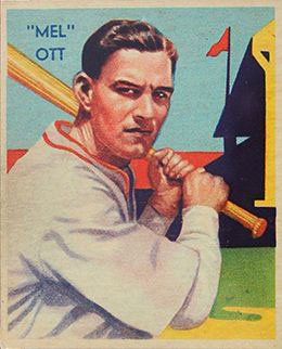
1. 1934-36 Diamond Stars
Issued by Boston’s National Chicle Company, the Diamond Stars set is something of a cardboard miracle in that it openly pulls from German Expressionism and Art Deco architecture. This is a set every bit as angular and geometrically-based as films like The Cabinet of Caligari and Nosferatu, with early American skyscrapers providing crossbeams of rectilinear color — often in a vermillion hue — that play foreground angles off of background ones, so that the eye remains perpetually in motion but drawn towards a stabilizing center where we most often find the heroes of yore. Or are met with their penetrating gaze, as with the set’s tour-de-force Mel Ott card. Ott is all diagonal motion with his card, his front arm parallel with his bat, each moving from the design’s bottom right corner to its top left quadrant. A grandstand flag at the top right of the composition angles towards the bottom left, creating a suggested visual crosscurrent flow to offset the established direction of arm and bat, a shadowy band of upper deck seating at the right margin serving as a form of stadia silhouette for Ott’s lantern jaw. This man is a slugger, clearly, and we know so because a highly sophisticated visual byplay has posited him as such. The park seems barely big enough to hold him, and yet Ott occupies what we might think of as the card’s sweet spot, just as a bat has one. The park — the Polo Grounds, as it were — may barely be able to hold Ott, but this is where he belongs. Swatting. That Ott also overpowers the sky in the composition — it beats a retreat out of the frame — speaks to the man’s talents for launching baseballs at said sky as well, flight being advisable. And to a kind of art where one rarely expects to find art. But like each of Ott’s 511 career home runs, there it is, only in a more miniature — and perhaps more populist — form than we’ve come to expect with pictorial art that we hold as museum-worthy. But hey: If Joseph Cornell made art from the likes of shoe boxes, why shouldn’t some forms of art be found in them from time to time as well? • 3 September 2013