


“Color is one of the great things in the world that makes life worth living to me and as I have come to think of painting it is my effort to create an equivalent with paint color for the world — life as I see it.”
Georgia O’Keeffe, 1937
Georgia O’Keeffe’s flowers, skulls, and landscapes greatly shaped 20th-century American artistry. Her paintings are distinctive, not only due to her identifiable style of focusing on the richness of nature, its shapes, its colors, and its beauty but also due to the tranquil culmination of warm and cool tones and muted textures. Like much art, O’Keeffe’s works are dispersed across the globe (I have only seen one O’Keeffe painting in person at the North Carolina Museum of Art). Fortunately, much of O’Keeffe’s artwork can be found on the Georgia O’Keeffe Museum website. With an abundance of digitally archived material, the Museum website allows users to break down the full collection via dates, themes (Buildings and Architecture; Flowers; Landscapes; Portraits and Human Figures; Rocks, Bones, and Shells; Trees) and materials (with more than 40 different materials listed). However, users are unable to organize the collection via color. Yet as the Museum writes: “A brilliant colorist, O’Keeffe created strong, vibrant works with colors that glow with energy and vitality” and “The power of Georgia O’Keeffe’s artwork derives from her mastery of essential elements of art making: line, color, and composition.” With O’Keeffe’s known and celebrated fantastical use of color, here I strive to explore its role even more — and prioritize it in how I view art.
The goal of this work was to rigorously evaluate the role of color in Georgia O’Keeffe’s paintings, as made available by the Georgia O’Keeffe Museum website, and in the broader context of the museum experience. In doing so, this work explores the identification of color in 134 Georgia O’Keeffe paintings as identified by a human coder and that of a computer to raise questions about objectivity in color identification.
Importantly, most scholarship and research surrounding O’Keeffe have focused largely on her artworks’ form, shape, abstraction, correspondence to nature, and the feminized role of the work and the artist. Yet, Ann Daly writes: “For O’Keeffe, it was color that brought a painting to life — that made it ‘talk’ and ‘sing.’ What looks like a white rose is tinged with blue and green. Contrasting hues vibrate against each other. Unlikely combinations became inevitable”. As Daly emphasizes, O’Keeffe’s utilization of color is poignant, blaring, and impossible to ignore. Yet, what is color? How do we conceptualize, read, engage, and experience color?
From the field of textile chemistry, Rhenzo Shamey explains that: “[Color] makes you feel things, but is not easy to explain . . . Color is an important, complex sensation that we’ve been trying to explain since antiquity, but it’s only in the last century or two that we’ve managed to make some meaningful strides there.” Importantly, color serves as a priority for this work, and I am not a color theorist expert, nor an artist. However, I did learn of ROYGBIV, or Red Orange Yellow Green Blue Indigo Violet, and the rudimentary basics of Johann Wolfgang von Goethe’s color wheel through the United States’ public education arts curriculum. Toddlers and young children learn about colors to help develop sense-making while this becomes more formalized as children enter into grade school (in the United States), where they may learn about Van Goethe’s color wheel, ROYGBIV, and even the science behind color. By emphasizing color’s corresponding complexities, this work serves as an example of data humanism, as developed by Giorgia Lupi, when we rely on color as a foundation for data. As Lupi explores, this analysis strives to “embrace complexity” and “remember that data is imperfect. (as we are).”
There is no shortage of literature that illuminates the significant complexity in experiencing, quantifying, and categorizing color — and yet, I argue that there is potential value in exploring how color can serve as an organizational factor for our experience of art, especially for an artist who is renowned for her use of color. As such, I wonder: What color trends can we identify in Georgia O’Keeffe’s paintings? What is the relationship between my readings and recognition of color and that of the computer?
Importantly, as I was physically unable to access and observe O’Keeffe’s artwork in person in New Mexico, I instead accessed and viewed the Georgia O’Keeffe Museum’s website and all artwork through my personal computer. While there is a limitation in not being able to experience and view these paintings in person, as digital renderings are a mediated or altered version of the original piece (and perhaps even a remediation of a mediation as Susan Sontag might lead us to wonder); however, I leaned into this challenge to thus compare my own reading and recognition of color with that of a computer.
In total, there were 1,137 digitized pieces in the Collections Online: Art — including 144 paintings, 200 photographs, 12 sculptures, 1 sketch/sketchbook, and 773 works on paper. To narrow this down, I focused specifically on the 134 complete paintings as accessible and available on November 1st, 2021. With these paintings, I followed the following process:
- I downloaded all 134 paintings to my computer from the Georgia O’Keeffe Museum Online Collections.
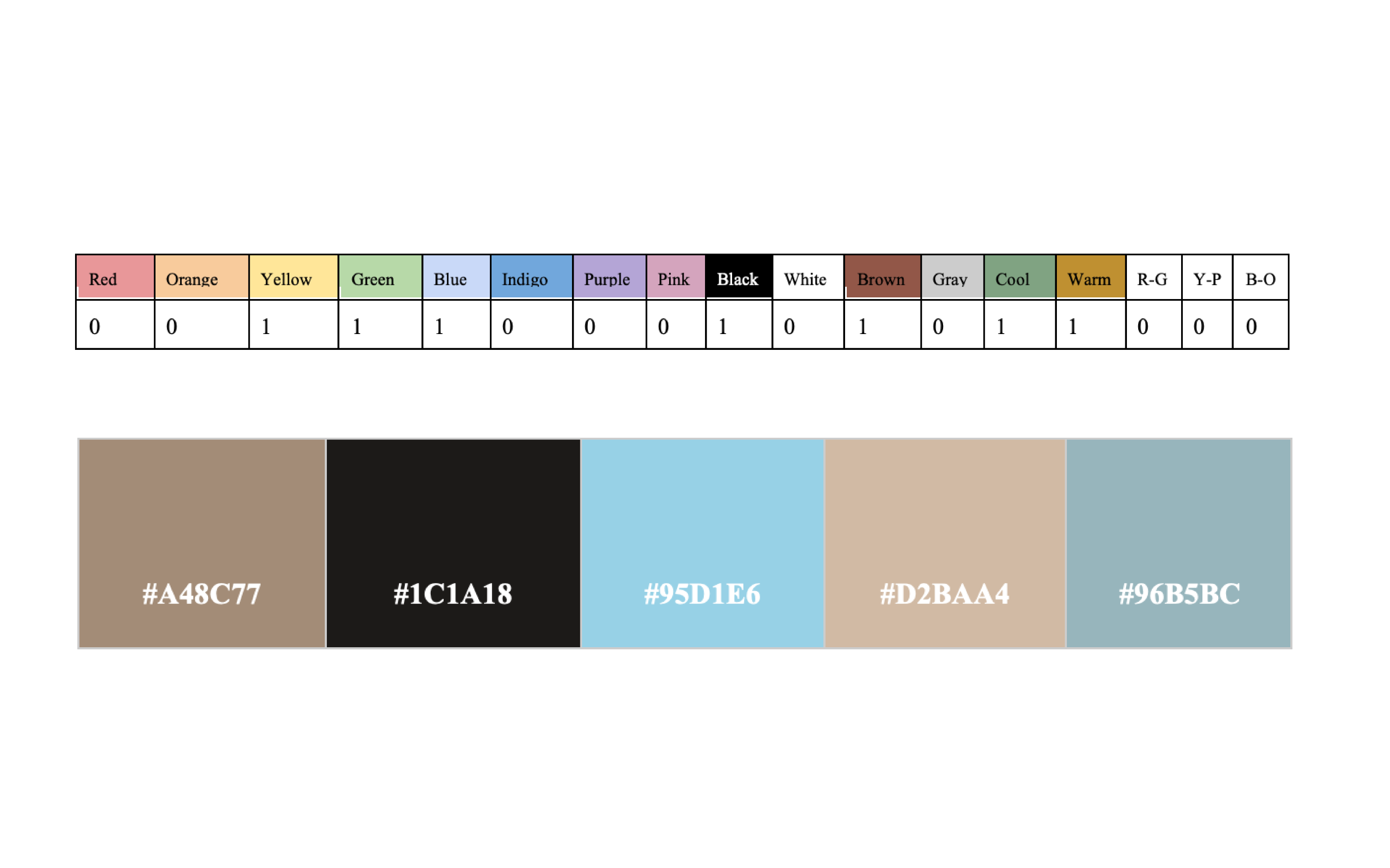
- I then hand coded the identification of ROYGBIV (and White, Black, Brown, Grey, and Pink), and color combinations (warm, cool, complementary colors). I coded this by noting which colors were present for each painting, as well as which were not. It is incredibly important to note that I physically am able to see and perceive color across the ROYGBIV spectrum. As such, my coding reflected the way that I can and am able to see color. Conversely, my father, who is Red-Green colorblind, would identify different colors and correspondingly produce different color codes.
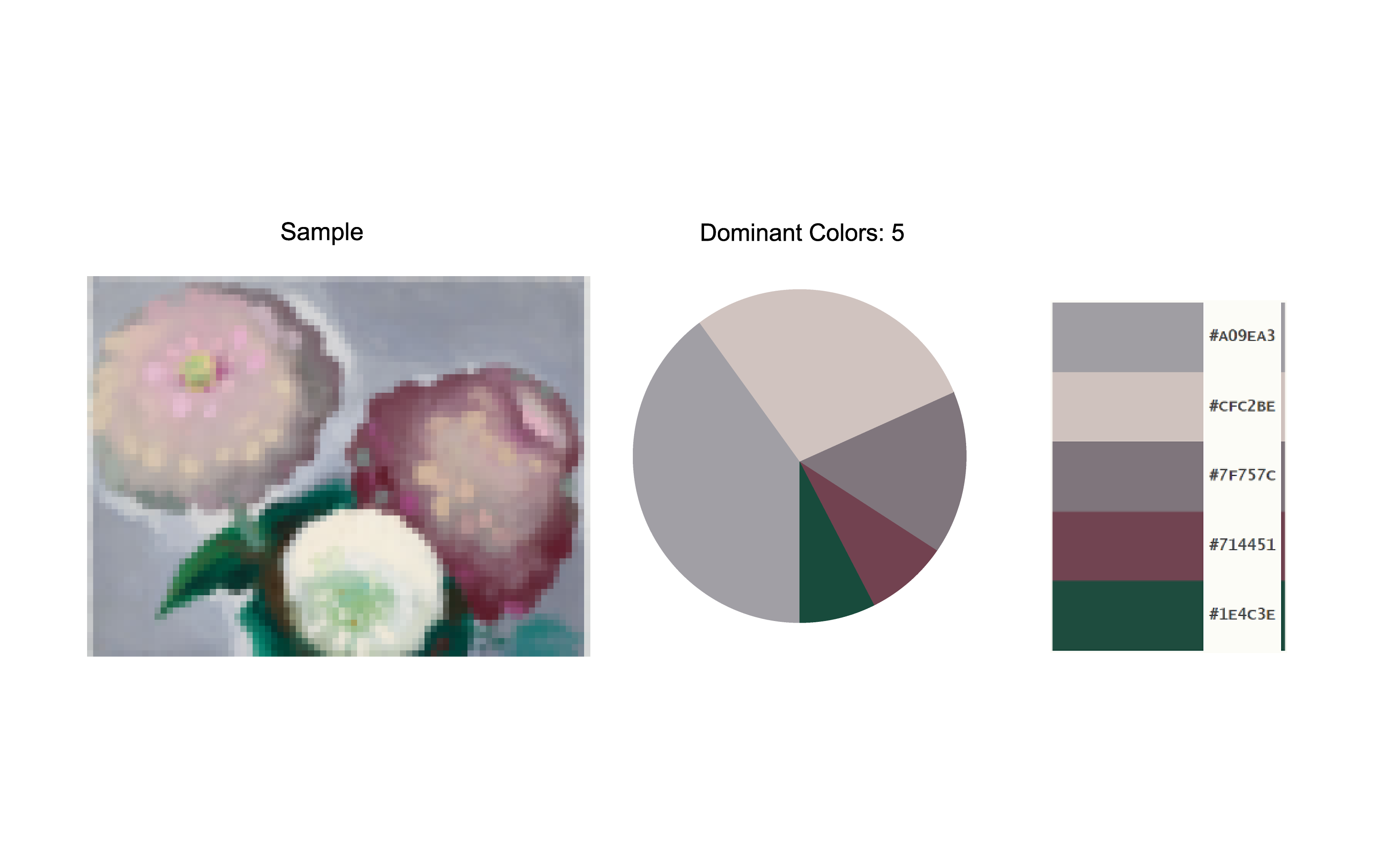
- I then uploaded each painting to Palette Generator, a free web-based platform that prioritizes constructing color schemes with the click of a button, to obtain 5 HEX color codes for the paintings that represent the 5 most present (take up the most surface area) colors in each painting. Please see the example below.
- I then compiled these color codes into the figures below.
“The men didn’t like my color. My color was hopeless. My color was too bright.
I liked colors.”
Georgia O’Keeffe
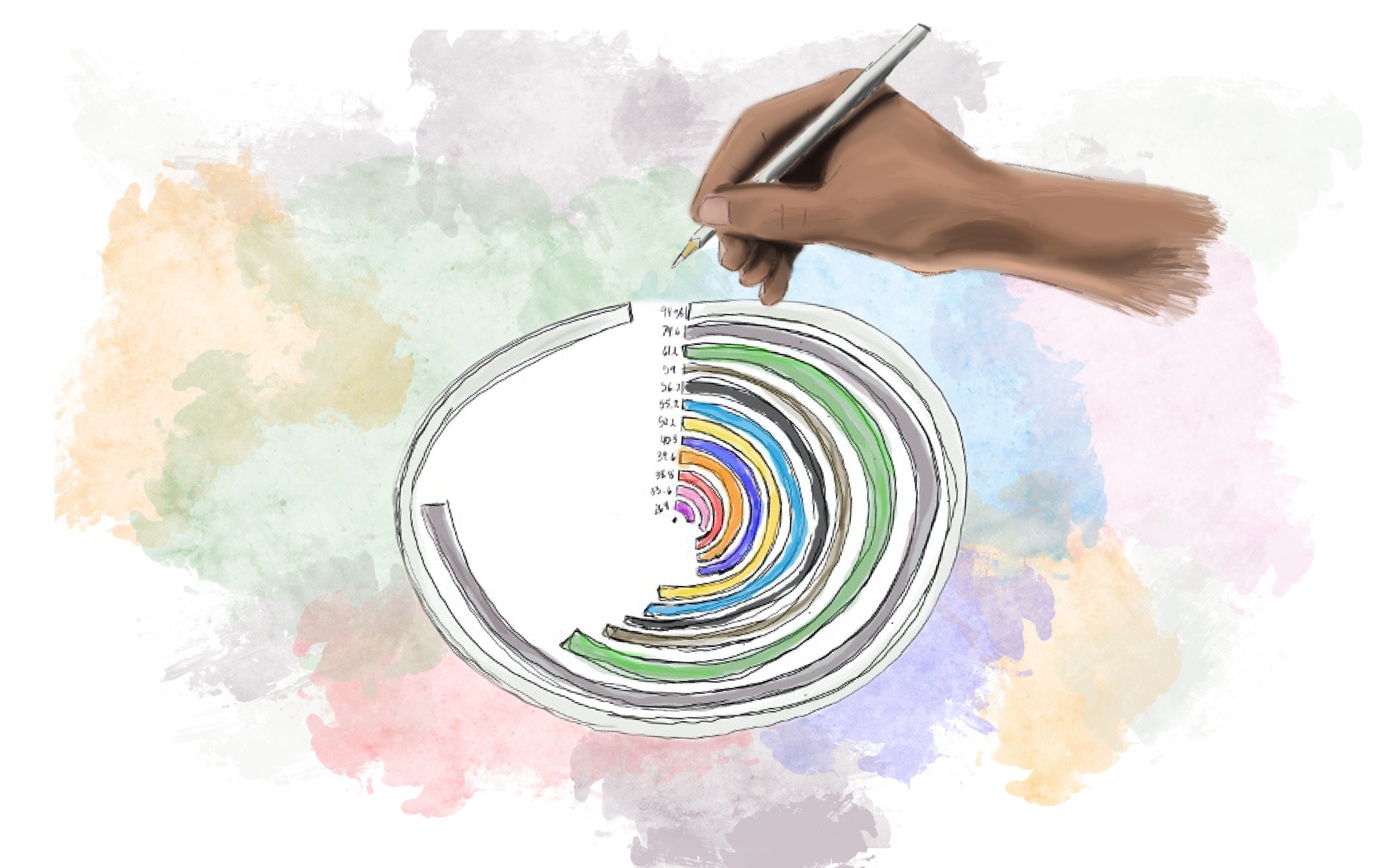
The visual above shows the various colors I recognized across O’Keeffe’s paintings within the Georgia O’Keeffe Museum. O’Keeffe utilized white (94.03%), gray (74.63%), and green (61.19%) the most in her paintings that are housed by the Georgia O’Keeffe Museum, whereas purple (26.87%), pink (33.58%), and red (38.8%) were among the least used. Simultaneously, all the colors that were evaluated were identified in O’Keeffe’s paintings as digitized and housed by the Georgia O’Keeffe Museum, and each color was identified in at least 25% of these paintings.
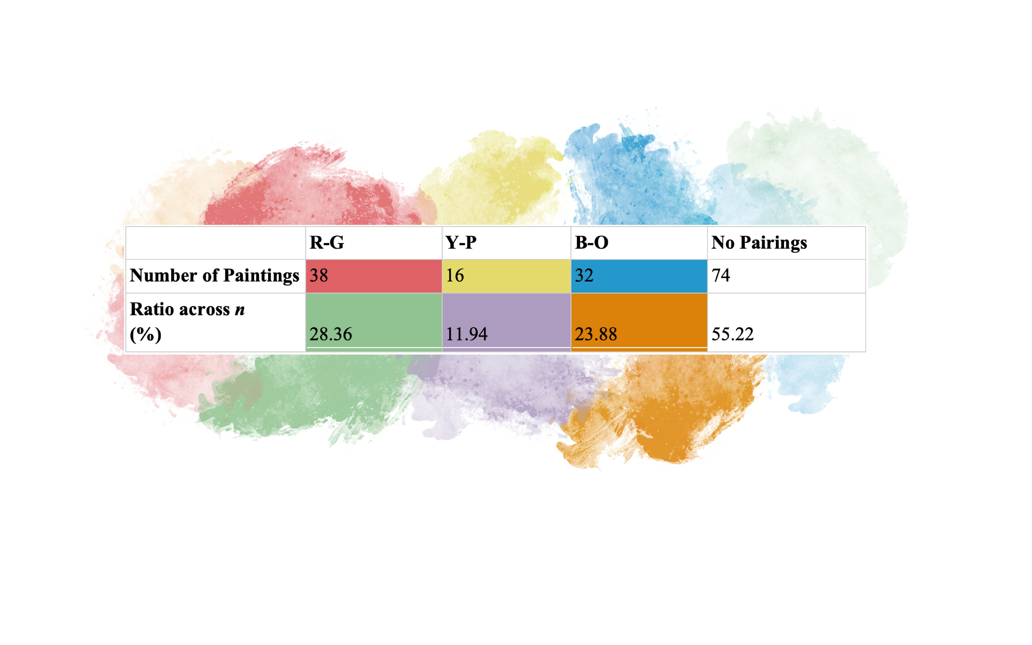
Lastly, Figure 4 below illustrates the complementary color pairings across the 134 coding paintings. Importantly, a far majority of the paintings coded did not have any complementary color pairings in the composition, with no pairings (0 R-G, 0 Y-P, 0 B-O) identified in 74 paintings (55.22%). Thus, the remaining 44.78% of paintings with identified pairings contained multiple complementary color pairings within a single composition.
Interestingly, the computer read the entirety of the image as part of the painting; therefore, if the Georgia O’Keeffe Museum’s digitized rendering of the painting included a black edge/frame the computer identified this as part of the painting, whereas I did not. More importantly, perhaps, this also resulted in the focal colors going undetected by the computer and the HEX code compiler. The painting Patio Door with Green Leaf with its corresponding coding below is an excellent example of this.
Together, this process and these different results emphasize a sense of differentiated effectiveness, where color reading and identification are performed and accomplished in different ways by the human coder (myself) and the computer. Throughout this work, I identified the presence of each color variable (ROYGBIV + White, Black, Brown, Grey, and Pink), but these fell into unspecified and broad color categories. I did not distinguish between an orangey-red or a yellowy-orange, a teal blue or a sea-green. My coding did not illustrate what specific shade or hue of brown or yellow was used in the painting. Looking at my codes alone, one would likely be unable to envision the composition’s colors accurately. Opposingly, the computer calculated the exact colors based on the largest surface areas in the composition (with corresponding HEX codes), yet this reading ignored the role of color in detail — as well as the visual weight and impact that smaller surface areas can significantly influence in a piece’s composition. With that said, however, the above images, together, illustrate the capacity of computational color reading in relation to human-identified color.
The data also reveals trends over time, namely longitudinal color patterns — where we can identify shifts, changes, and instances of color consistency across O’Keeffe’s paintings in relation to time. This is showcased in the tables below, which provide a demonstration of color contrast with a sample of O’Keeffe’s earlier paintings in the late 1910s as well as that from the late 1930s.
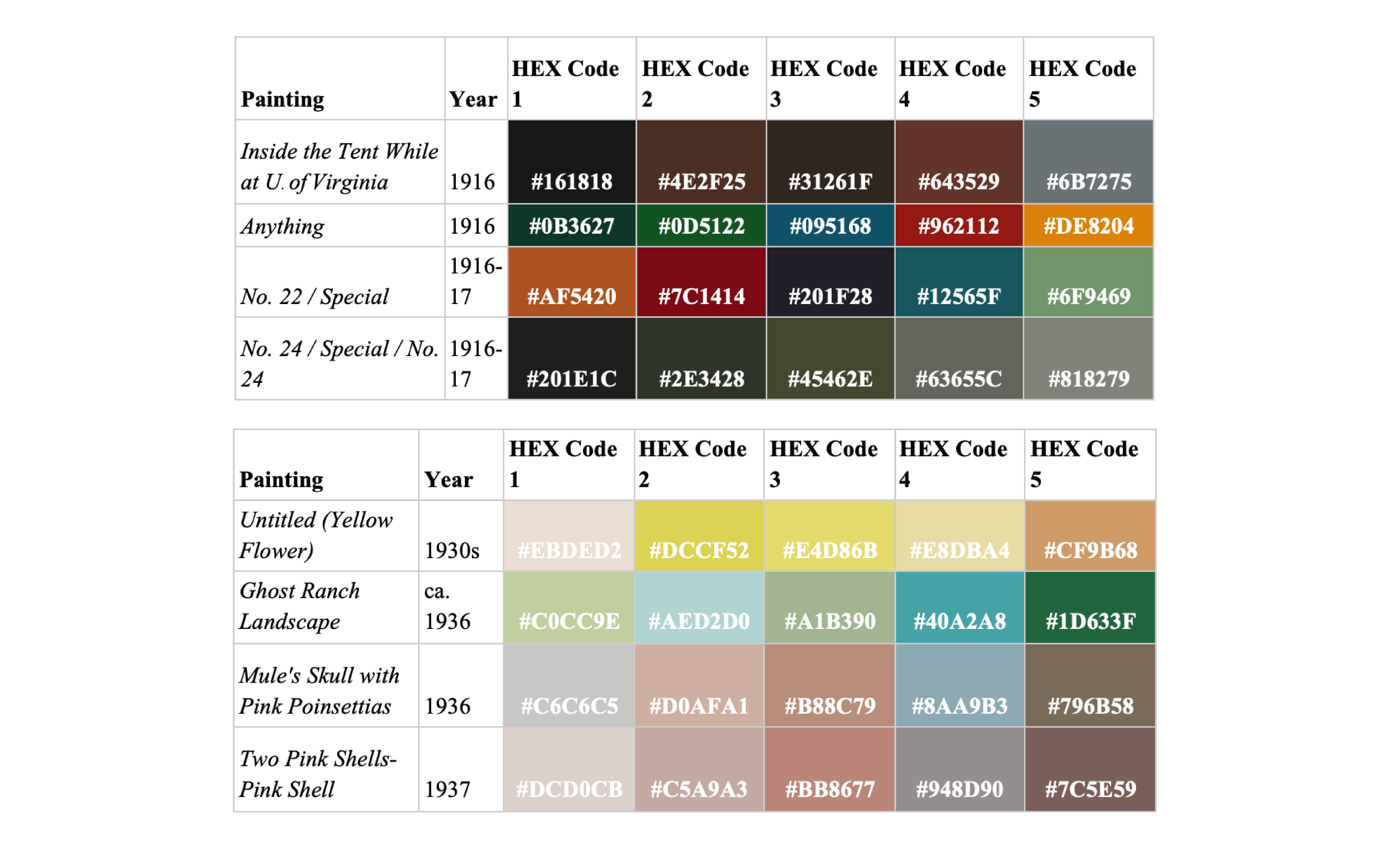
As the Georgia O’Keeffe Museum has the paintings categorized alphabetically, I subsequently coded them in the same manner. I then retroactively organized the computer-read color identification and coding chronologically. In doing so, I was able to see how O’Keeffe’s earlier artworks predominately used darker, bolder colors — whereas her artworks started featuring lighter, less saturated colors around the 1930s onward, as demonstrated in the above figures. This understanding of color and the overall experience of reading color would not have been possible without the chronological ordering of the HEX codes derived from the computer’s coding of these paintings.
Importantly, these findings are interesting and valuable, not only for the patterns that they reveal, but rather because they illuminate the complexities of thoroughly considering color and the ways we read, identify, and experience color. These results also demonstrate how my own color identification differed strongly in nature, data, and emphasis from the results compiled through Palette Generator. Simultaneously, this study also revealed the limitations of both computer-identified/coded color, and that of my own — seen specifically in how the computer read the entirety of the digitized composition file to deduce the colors with the largest surface areas, whereas I identified the presence of broad categories of color based on my own privileged way of identifying and seeing color. Collectively, these methods demonstrated new ways of seeing and experiencing art that differ strongly from how we traditionally interact and engage with it. Rather than visiting a museum and observing pieces in person for the experience of viewing art in its museum housing, here, I studied them online — viewing through a lens of prioritizing color over the subject, theme, material, and how I felt about the piece.
Because of this process, we can continue to ask: Where else might we prioritize reading and experiencing color? In what other ways can we read and interpret art as well as other pieces of media around us? How might the education system also embrace the varieties in seeing, experiencing, and understanding color and its complexities?
The findings of this work add to mixed-method artistic media analysis, bringing together visual content research with media studies and computational humanities — while also contributing to the mission of the Georgia O’Keeffe Museum: “To inspire all current and future generations, the Museum preserves, presents, and advances the artistic legacy of Georgia O’Keeffe and Modernism through innovative public engagement, education, and research.” •