Throw Caution to the Wind

My free túk-túk ride turned out to be a scam... but it was worth it for the great story.

§

in Archive

EmailTwitterFacebookDigg


Picture, if you will, a tall man walking around Athens. He is staring at the buildings, unable to read the signs. He has only a vague idea of where he is. He has a wild mane of graying hair poking out from under his Gatsby cap, and he would never be mistaken for a Greek.

He’s my father-in-law.

This was some years ago. He told us the story later: A man approached him and introduced himself. He said he’d lived in the United States and wanted to practice his English. My father-in-law said he was in a hurry, but the man insisted on buying him a drink. So he shrugged and went along to a little bar around the corner.

They talked for a few minutes. Then a couple of women joined them, and soon the man disappeared. The women were friendly — very friendly — and started ordering drinks. Then more drinks. “Boy,” my father-in-law thought, “these Greeks sure are friendly.” And then, “I wonder who’s paying for all these drinks?” As he got up to leave, he was presented with a bill for $30.

He got his answer: The sucker was paying.

Tourism, even in its legitimate form, is an extractive industry, mining the pockets of outsiders. Often, there’s a fine line between a lawful transaction and a scam. But the fact is that most of us who travel will be scammed at some point, whether it’s by a money changer, a market vendor, or a mobster. They can see you coming from miles away — your clothes, your gait, the way you look around. You try to blend in. But they still find you.

Some scams are timeless, and replicated in various permutations throughout the world. There is the police scam, in which someone purporting to be a police officer tries to extract a bribe for some “problem” with your passport. (Tell him to follow you to the nearest police station.) There’s the rear-ending scam, in which a car in front of you slams on the brakes, then someone removes your luggage from your trunk. (Keep your bags in the car with you.) There’s the bird dropping/mustard scam, in which the moment you find yourself covered with a given substance, someone mysteriously appears with a towel to clean you off — meanwhile, also cleaning out your wallet. (Keep your wits about you.)

Scams often are more of an annoyance than a real danger. They are also relatively rare. You shouldn’t go around suspecting that everyone is out to steal your wallet. Kindness, generosity, and altruism are the currency of social interaction, and no society can function without them. Still, anonymity is the enemy of altruism, and the shallow relationships of travel are too much for some elements to resist.

By definition, a scam is something you don’t figure out until it’s happened. When my wife and I moved to Bangkok, Thailand, we fell for a scam we had actually read about.

We were walking along the wall of the royal palace when a guy came up to us. “Hello,” he said. “How are you today?” His English was suspiciously polished. He asked where we were going, and we told him.

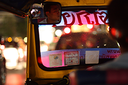
“Oh, sorry, the palace is closed today,” he said. “Thai holiday! But there is another temple that is open.” He flagged down a seemingly random túk-túk. As if hypnotized, we climbed on.

The túk-túk sped off and took us to a tailor shop. We went in, looked around, slightly confused, then came out. The driver wasn’t happy. “Okay. We go one place, then I take you to see standing Buddha.”

He pulled into a small alleyway filled with túk-túks bearing other farang (foreigners). He pointed to the door of a large gem store. We went in, looked around again, then came out.

“No, no!” he said. “You go too fast. You go back, take long time looking.”

“We don’t want to buy anything.” I said.

“No problem,” he said. “You just looking, I get free rotang.”

“Free what?” I asked.

He pointed to his gas tank, and I understood. We went into the shop and browsed through several floors of overpriced, possibly fake gems. When we finally came out, the driver gave us the thumbs up. His tank was full.

The standing Buddha was a beautiful, tall statue, all in gold. There were no other tourists anywhere. We took photos, got a bite to eat, and went to catch our ride back home. But the driver was long gone, so we walked back to our hotel, knowing we’d been taken for a ride. At least it was a free one.

Every human interaction entails some risk. When you travel out of your country, that risk grows, but so does the reward. If you wanted to hedge your bets and never lose, you would never leave home in the first place. That risk is part of the thrill of being abroad: learning new rules, mastering new games.

The trick is to know which ones to avoid at all costs, and which ones you can safely embrace. Chances are you will lose a few and win a few, or at least come out even. You will meet many more good people than bad. But if you do meet someone who outsmarts you, don’t let it ruin your day, or your trip.

Because, as my father-in-law said after he’d paid his dues in that Greek bar, “I figured it was just the price of a good story.” 5 April 2013

EmailTwitterFacebookDigg

I write a small newsletter about environmental policy, which means I spend a lot of time reading things I only partially understand. Last fall I was trying to make sense of a paper in Nature Climate Change about sea-level projections. Not because anyone assigned it to me, but because I’d read a newspaper column that cited it, and the column was doing that thing newspaper columns do when they summarize research: collapsing months of careful work into a sentence designed to make you either angry or afraid. I wanted to see for myself what the researchers actually found.

 
The paper was open-access, which was the first good sign. I downloaded the PDF, scrolled past the abstract (too compressed to be useful to anyone outside the field) and did what I suspect most non-specialists do when they open a journal article: I went straight to the figures.
 
This is, I think, common behavior. When you don’t know a discipline’s vocabulary well enough to parse its prose, the figures become your interpreter. They’re supposed to condense the finding into something your eyes can grasp faster than your reading can. The figure is where you go to decide whether the rest is worth your time.
 
So the figures in this particular paper should have told me something. They did, technically. They told me the authors were using MATLAB, probably with default settings. The color scheme was a rainbow gradient, red through yellow and green to blue, applied to data where the only meaningful distinction was “higher” and “lower.” The axis labels were in 8-point font. One figure had a legend that required me to distinguish between six shades of blue-green, which on my laptop screen compressed into three.
 
I stared at Figure 3 for what felt like a long time. A time series of some variable I thought I understood. The lines went up. That part was clear enough. But the confidence intervals overlapped so thoroughly that the visual message amounted to: anything could happen. Which may have been the scientifically honest message. It was not a communicatively useful one.
 
I closed the PDF and reread the newspaper summary. At least it had the decency to be wrong in a way I could follow.
 
Edward Tufte, in his 1983 book The Visual Display of Quantitative Information, made a case that has become a kind of commandment in data visualization circles: “Above all else show the data.” The principle is simple, almost tautological. A figure exists to make data visible. If it obscures, decorates, or distracts, it has failed at its only job.
 
Tufte is the canonical reference here, but a more interesting one might be W.E.B. Du Bois, who in 1900 created sixty-three hand-drawn data visualizations for the Paris Exposition. His charts depicted the economic and social conditions of Black Americans, and they were gorgeous: spiraling color wheels, stacked area charts with hand-lettered labels, bar graphs composed with the compositional care of a painting. Du Bois understood that a figure is an argument. Its visual form is part of what it means. His charts didn’t just present data about inequality; they demanded that viewers look at it, carefully, by making the looking itself a considered experience. They won a gold medal.
 
By that standard, most scientific figures today are failing. Not through malice or incompetence, but through inattention. The people making them are researchers, trained to design experiments, not graphics. They reach for whatever plotting software their lab uses, accept its defaults, and move on. The figure is the last thing finished before submission, assembled sometime around midnight on the day of the deadline. Nobody stops to ask whether a reader will be able to parse it.
 
I understand this. I know about deadlines and the triage of priorities. When you’re trying to get a manuscript through peer review, the prose matters, the statistics matter, the figures are whatever the code produced. Reviewers rarely comment on visual quality unless something is egregiously misleading. The incentive structure rewards publishable data, not communicable data. These are different things, and the distance between them is where public understanding of science goes to quietly erode.
 
My friend Sarah teaches introductory biology at a university in the Midwest. A few years ago she started an experiment of her own: she assigned Tufte’s book as required reading before students could begin their research posters.
 
Most students had never thought about a figure as something you design. A figure was something you generated. You ran the analysis, the software produced a chart, you put the chart on the poster. Design implied intention, and there had been no intention at any point in the process.
 
After the Tufte unit, she told me, three things happened. Students stopped using 3D effects. They stopped using rainbow color maps. And they started arguing with each other about what the figure was supposed to show, not what data it should include, but what message it should deliver. She said that last part surprised her. She’d expected better aesthetics. She hadn’t expected a shift in how students thought about communication itself.
 
“Nobody taught them to make figures,” she said. “They learned by copying their advisors, who learned by copying their advisors. The chain goes back to whenever Excel became the default and nobody questioned it.”
 
I asked whether the posters actually improved.
 
“The bad ones got less bad. The good ones got much better. A few of them looked like they were designed by someone who’d thought about the person standing three feet away, trying to learn something.”
 
I asked if it lasted. Whether students carried the habit into their graduate work or reverted to lab defaults the moment a thesis advisor handed them a different plotting library.
 
She paused. “Some revert,” she said. “The pressure to match what everyone else in the lab does is strong. But a few of them keep fighting the defaults. Those are the ones whose papers I can actually read.”
 
That phrase stuck with me — “thought about the person standing three feet away.” It gets at the thing most scientific figures are missing. Not skill, not software, not time (though all three help). What’s missing is a reader.
 
I started paying closer attention after that conversation. I’d open papers the way I always had, figures first, and try to articulate what was going wrong when a figure failed to communicate. Usually it wasn’t one catastrophic choice. It was an accumulation of small neglects. A color palette chosen because it was the software default, not because it mapped onto the data’s structure. Axis labels abbreviated into acronyms that meant something to the authors and nothing to anyone else. Legends that required cross-referencing with a table buried three pages later. Each choice individually forgivable. Together, they built a wall.
 
The worst part was that the underlying findings were often interesting. I could tell, from the surrounding text, that the authors had discovered something worth knowing. But the figures, the part of the paper that should have carried the finding most efficiently to the widest audience, had been treated as an afterthought. The ideas were good. The transmission was broken.
 
A few months after that conversation with Sarah, I was trying to recreate one of those broken figures for my newsletter. I wanted to show readers what the sea-level projections actually looked like when you stripped away the clutter. I’m not a designer. I can use a spreadsheet. The results were predictably mediocre.
 
While searching for alternatives, I stumbled onto tools for generating scientific figures from text descriptions. The concept was simple: instead of building a chart element by element, you describe what you want it to communicate, and the tool handles the visual choices. I tried one called FigureGPT on the sea-level data.
 
The output wasn’t art. But it was clear. Two distinct trajectories, labeled in readable type, with uncertainty shown as a shaded region instead of spaghetti lines. I hadn’t specified any of those design decisions. I’d just described the point I wanted the figure to make. The tool had produced something that a non-specialist could parse in ten seconds. My hand-built spreadsheet version took thirty and still left ambiguity.
 
What struck me about this wasn’t the technology itself. It was what the technology revealed about the problem. The original paper’s authors had better data than I did, better software, better training. The difference was that they’d built their figure for the analysis pipeline. I’d described mine for a reader. And the tool, by asking me to articulate the point before it could produce anything, had forced exactly the moment of intention that Sarah’s students learned in her Tufte unit: what is this figure supposed to tell someone?
 
I don’t think automation replaces the kind of deep visual thinking Du Bois brought to his data portraits. That was artistry married to argument. But for the vast majority of scientific figures, the ones assembled at midnight by someone who needs something in the manuscript by morning, a higher default floor matters. It’s the difference between a figure that was designed and one that was merely produced.
 
There is a strange irony at the center of all this. Our visualization tools have gotten extraordinarily powerful. Our figures have gotten worse. It’s a version of what Michael Lind once called technological regress: a system that advances in capability while declining in the quality of its outputs, because nobody is paying attention to the part that faces the user. The tools can do almost anything. The humans operating them are asking for almost nothing.
 
Science is under political and cultural pressure it hasn’t faced in decades. I don’t think better figures will fix that. The roots of distrust are structural, economic and political and tribal, and no amount of good typography will paper over them. But I do think that scientists control more of the communication pipeline than they exercise. Every time a curious non-specialist, a teacher, a journalist, someone like me with a downloaded PDF, encounters a figure that was made for no one, something small is lost.
 
I don’t mean this romantically. I mean it practically. My friend Dana works in public health communications for a state agency. Her job, as she describes it, is “translating papers into things a legislator can read at breakfast.” Last year she received a report on childhood nutrition outcomes in rural counties. Seventeen figures. Every one technically correct. She sat with them for an afternoon and could not construct a coherent briefing.
 
The problem wasn’t the science, she told me. The problem was that the figures had been designed for peer review, not for a committee staffer with eleven minutes before a hearing. She spent three days redrawing them, simplifying color schemes, relabeling axes in plain language, cutting six figures entirely because they duplicated information already in the other eleven.
 
“They’re not making figures for us,” she said. “They’re making them for the journal. We just happen to need the same information.”
 
When a figure is clear, a reader who isn’t an expert can at least locate the claim. They can see the trend, the comparison, the uncertainty. They may not follow every detail, but they’ve been given an honest entry point. When a figure is opaque, not because the science is complex, but because nobody thought about the person looking at it, the entry point doesn’t exist.
 
I went back to the sea-level paper a few weeks later. Someone had linked me to a blog post by a science communicator who’d redrawn Figure 3 using the same data. Two colors instead of six. Confidence intervals as a shaded band rather than overlapping spaghetti lines. Axes labeled in words a person might use in conversation.
 
The finding came through immediately: under high-emission scenarios, sea-level rise by 2100 was projected at roughly double the moderate-action trajectory. Uncertainty was real but the direction was not in doubt.
 
I had the same data the whole time. The numbers were there in the original paper. But I couldn’t reach them, because the original figure hadn’t been made for anyone. It was output, not communication. Somewhere in the chain from analysis to publication, nobody had paused to consider who might be on the other end, trying to understand.
 
Maybe that sounds like a small thing. One person failing to read one figure in one paper about a topic she could have learned about from a dozen other sources. But I think about Dana redrawing seventeen charts by hand. I think about Sarah telling her students that a figure is not a puzzle. I think about Du Bois, painting data by hand because he understood that how you show something is part of what it means.
 
Mostly I think about the next paper I’ll download, and whether the figures will let me in. I’m not optimistic. But I keep opening the PDFs.

§