On the Wild Side

On the value of being stopped in one's tracks.

§

in Archive

EmailTwitterFacebookDigg

When I was a kid my parents would drive to Atlantic City, and I’d be in the back of our blue Nash on one of the two jump seats, looking out the open window. We knew we were getting close when we could smell the marshes, which we could do even before we could see them. The good stuff was on the other side. Even now when I should know better, it still often seems that the good stuff is always on the other side.


On the other side of what? Of whatever seems to be in my way between here and where I want to be — or, more accurately, where I want to go.

Lately I’ve wanted to see what lies at the end of little roads that run toward the water. Some of the roads stop well short of the river. Those aren’t as frustrating as roads that go all the way to the shore but allow no parking from the first turn off the highway down to where there’s sure to be a splendid view. Signs that say, “No Parking,”  “No Stopping,”  “Private Road,”  “Beware of Dog,” or even, “Dog Bites” have kept me from exploring further.

Law abiding though I may be, “Dog Bites” has more teeth than “No Parking.” Sharper teeth and longer.

In the late ’70s I was walking with a friend in Poughkeepsie, New York when, by chance, we came across the gateway to Locust Grove, the estate of Samuel Morse. Although a sign said that the home was closed, we thought the grounds would be open and might yield a view of both the house and the Hudson River.   No sooner had we stepped into the estate’s driveway than two huge Dobermans, barking and snarling, hurtled towards us.

All four of us stopped. I tried to remember whether I was supposed to look the dogs in the eye or look away. We must have chosen the right thing because the dogs didn’t rip out our throats.  My friend and I backed up while the dogs growled and held their ground. From the corner of my eye I could see them, ready to spring on us. Slowly we turned and walked away. How far would we get before the dogs attacked? Why hadn’t anyone posted a sign that said, “Beware of Dogs”?

Once was enough.

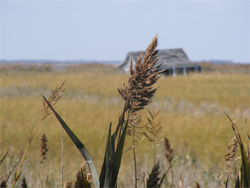
Joe and I drove to the end of the road, glimpsed the sun’s glint on the blue water that ran through the tall marsh grasses, and turned the car around without stopping.

Finally we found a road that wasn’t posted, which led to — and apparently through — the marsh. The paved section of the road ended, and the orange dirt road ran through Phragmites australis — a tall, plumed grass — and Spartina. Elsewhere, at a designated viewing spot, the Coastal Heritage folks had put up a sign identifying local flora and fauna. Salt hay and cord grass — both species of Spartina — make up the bulk of the marshes. Joe, who had once cut quill pens from Phragmites for his artwork, pointed out that the sign depicted greenhead flies to be about the same size as muskrats. (Actually, greenheads are only about an inch long, but I’ve never been bitten by a muskrat.)

Just past a clearing where we could park, dirt was heaped all the way across the road. This was no mere speed bump — it was more than a foot high. Time to get out and walk. In the road ahead large puddles reflected the blue sky.

And butterflies! A few monarchs and dozens of buckeyes fluttered around and settled on a tree by the side of the road. I sidled up to the tree to take a closer look. I stood still so I wouldn’t frighten them away. I’d never seen so many Buckeyes in one place.

Joe had gone ahead on the road that stretched into the marsh and turned so that it vanished in the tall grasses. Skirting the puddles, making sure I didn’t slip on the mud, I made my way to where he waited.

Water flowed from a channel on the right side of the road to a corresponding channel on the left. It was too wide to step over. It didn’t look deep — just over my ankle, I calculated.

“Do you think the water’s clean?”

“Sure. The marsh purifies it,” he said, adding, “You can’t drink it.”

“It’s probably brackish,” I said, wondering just how salty it would be. I was tempted to taste it.

The road curved ahead, leading, perhaps, to open water. Once more, the good stuff was on the other side. Maybe I could wade — I wore sandals thick-soled like tire treads. They’d be fine. I eyed Joe’s sneakers. He balanced on a flat rock someone must have placed as a steppingstone. The rock wobbled. The school of tiny fish (maybe silversides) had darted away. The crabs scuttled to imagined safety. If crabs imagine.

Joe stepped back on land and the schools of fish returned. A blue crab edged into view. The New Jersey Department of Environmental Protection, translates the blue crab’s full scientific name—“Callinectes (Greek for beautiful swimmer) and sapidus (Latin meaning tasty or savory.)”  Tasty? The baby crab was safe from us.

The ground was wet for about eighteen inches on either side of the flowing water. These are tidal marshes, so the water on the road would either get deeper or disappear. A smart phone with tide tables would have been handy.

I wanted to lie down, elbows on that damp orange margin, chin in hands so I could get a better look at the tiny silver fishes and nervous crabs. My white skirt would get filthy, perhaps stained. My T-shirt would, too.

The silence of the salt marsh wasn’t really but an almost inaudible susurrus of grasses stirring in the wind, an occasional bird cry (I hoped for but did not hear the familiar red wing blackbird.), the splash of something landing in the water. Was that a leaping fish or a diamondback terrapin? We saw only the widening circle on the water’s surface.

The longer I watched, the more I saw; the more I saw, the more I wanted to see. I had just reminded myself that we were on a road when I heard the approaching roar of an ATV. The ATV raced through the puddles, and, as we stepped aside to let it pass, through the flowing water. The noisy interlopers sped down the road, heading towards the very place I had wanted to go.

For a few moments the water was opaque.

The fish would have darted away — had the crabs escaped being crushed? The sediment settled back to what I now saw as the bed of a creek rather than water moving across a flooded road.

The little fish and crab returned. I promised myself that the next time I read J. Alfred Prufrock’s lament that he “should have been a pair of ragged claws / Scuttling across the floors of silent seas,” I’ll think of this small blue-clawed  “beautiful swimmer.”

This time the good stuff wasn’t on the other side, after all. It was right there. Maybe sometimes we’re meant to go no further. Maybe what at first seems like an impediment is, instead, what we’re meant to experience.

Sometimes right here — wherever that is — is where we ought to be. Sometimes. Not always.

Sometimes you find a sign that says “Dog Bites,” and sometimes you find yourself face to face with the dog. • 13 October 2010

EmailTwitterFacebookDigg

A hand glides across a packed bookshelf, dismissing countless volumes in mere blinks. Then, a single cover arrests its journey. That brief halt—the moment a potential reader truly notices—is the crucible.
Romance novel cover art either triumphs with dazzling success or fades into silent oblivion right then.
Consider the sheer scale: American romance publishing brings in more than $1.4 billion each year. And within this colossal market, a book's cover artwork stands as the paramount arbiter of its fate; it decides if a title is plucked from the shelf or simply ignored.
What follows unpacks the calculated design elements, mind-bending psychological tenets, and accepted industry benchmarks. These elements elevate romance novel covers from simple pretty pictures into potent engines of income.
Author, publisher, or graphic artist: grasp this. Forging truly captivating romance cover images directly shapes how readily books are found, what readers anticipate, and the ultimate tally of books sold.
Why Cover Art for Romance Novels Demands Strategic Design
Romance novel cover imagery follows distinct visual codes compared to other literary categories.
This happens because romance enthusiasts base their purchasing choices on particular visual hints. For example, Lauren Landish books comes with unique cover arts and edge colors and design tailored to her romance book genre. These cues hint at the story's overall feel, its level of intimacy, and the emotional journey promised within.
Unlike thrillers, which often underscore enigma, or literary fiction, which champions artistic expression, romance novel covers absolutely must convey genre expectations in fractions of a second.
The typical reader devotes a mere 1.5 to 3 seconds to examine a book cover before choosing whether to delve deeper. In digital marketplaces like Amazon, where thousands of romance titles vie for attention, that viewing window shrinks even more.
Publishers who pour resources into expert romance novel cover designs experience click-through rates from search results that are 20-40% higher than those with generic or shoddy covers. Such outcomes directly translate into algorithmic favoritism for books showing greater reader interaction.
Furthermore, a romance novel's cover cultivates reader confidence.
A skillfully wrought cover proclaims that the publisher or author treats the work with earnestness. This impression often corresponds with a heightened sense of the book's worth—irrespective of the actual manuscript's caliber.
Conversely, clumsy or poorly executed romance novel covers spark immediate doubt, leading prospective readers to assume the narrative itself is equally inferior.
The Psychology of Color in Romance Book Cover Design
The hues chosen for romance novel covers are not merely for decoration; they convey messages.
Distinct color schemes impart specific romance subgenre signals and emotional atmospheres to seasoned romance readers, who navigate this genre with a keen visual discernment.
Red holds sway over passionate, contemporary, and erotic romance. Around 65% of contemporary romance covers showcase red as a dominant hue, frequently paired with lustrous metals such as gold or silver. Red communicates fervor, longing, and immediate emotional stakes. Yet, plain red alone can feel common. The most potent romance novel cover art deploys red in refined pairings—think deep burgundy alongside blush tones, or spirited red accented by navy.
Soft pastels—blush, lavender, cream—point to sweet romance, new adult tales, or lighthearted contemporary narratives. These gentle shades lessen visual intensity and hint at emotional accessibility. Romance novel covers aimed at readers preferring emotional closeness over overt physical descriptions reliably feature pastel backdrops with illustrated or soft-focus visuals.
Deep jewel tones—emerald, sapphire, amethyst—set the stage for historical romance, paranormal stories, or darker modern accounts. These colors suggest opulence, riddle, and sophistication. Publishers creating romance novel cover art in historical or paranormal categories deliberately select jewel-toned palettes precisely because readers have learned to link these colors with those subgenres.
Gold and silver metallics express opulence and premium standing. When incorporated as accent colors or within the lettering on romance novel covers, metallics elevate a book's perceived worth. They entice readers seeking escape and aspirational tales. Metallic elements also boost clarity in thumbnail previews where digital vendors display books.
Typography: How Fonts Communicate Romance Subgenre
The selected typeface for romance novel covers acts as a genre indicator, every bit as significant as color psychology. Serif fonts—particularly elegant, sweeping serif varieties—grace 58% of historical and paranormal romance covers. They evoke classic romantic traditions and literary authenticity. Such fonts tell readers the story values emotional profundity and narrative complexity.
Contemporary and new adult romance often leans heavily on modern sans-serif fonts, frequently presenting geometric exactness or amicable rounded letterforms. This style of lettering in romance novel cover art proclaims approachability, relatability, and current-day settings. Specifically, rounded sans-serif fonts often hint at youthful main characters or emotionally frank stories.
Script and handwritten-style fonts frequently grace romance novel covers, but their presentation demands precision. When poorly executed, script fonts appear amateurish and hinder readability. Expert romance novel cover designs employ script fonts sparingly—typically for subtitles or secondary text—matched with robust sans-serif fonts for the main title. This preserves visual hierarchy and ensures clarity across all viewing dimensions.
The dimensions of type on romance novel covers absolutely must account for legibility in thumbnail views. A book cover appearing splendid at 8x10 inches may become indecipherable when shown as a 1-inch square on a mobile phone.
The most effective romance novel cover art positions the title in letters ample enough to remain clear when scaled down to 150 pixels, ensuring its discovery across all digital storefronts.
Imagery Choices That Define Romance Book Cover Performance
Romance novel cover art utilizes three main visual strategies: illustrated figures, photographic models, and abstract/textural backdrops. Each brings distinct advantages and cultivated reader anticipation.
Illustrated cover art for romance novels provides a creative malleability and an emotional vividness that photography simply cannot match. Illustrated covers dominate paranormal, fantasy, and historical romance realms. This is because illustration can portray supernatural elements, period-appropriate attire, and fantastical environments with complete artistic mastery. Top-tier illustration runs between $1,500 and $5,000, yet it yields singular visual distinction in crowded categories.
Photographic cover art for romance novels, showcasing model photography, holds sway over contemporary, erotic, and new adult romance categories. Approximately 72% of contemporary romance covers feature human models. Professional model photography expresses immediacy and genuine feeling. However, stock photography—which many independent authors adopt to reduce expenses—betrays an amateur production when the same models surface on numerous books, or when photographic quality falls short of professional benchmarks. Investing in bespoke photography or high-grade stock specifically licensed for book covers profoundly alters the perceived quality of the book.
Abstract and textural backgrounds in cover art for romance novels craft visual refinement while keeping production costs down. Gradient fields, watercolor effects, and textural components can cost considerably less than model photography or custom illustration, all while retaining a polished look. This method proves especially apt for contemporary romance, women's fiction, and emotional romance, where the emphasis rests on lettering and atmosphere rather than visualizing characters.
Strategic Positioning of Elements in Cover Art for Romance Novels
Expert romance novel cover designs adhere to particular compositional guidelines. These guidelines amplify visual resonance and uphold genre recognition. The title's placement occupies the upper 60% of the cover, guaranteeing it remains evident when books are lined up spine-out. The author's name appears conspicuously, yet subservient to the title, typically resting in the upper corners or the lower third.
Focal points in romance novel cover art—be they faces, embracing forms, or central imagery—reside in the center-right spot about 60% of the time. This placement mirrors reading tendencies, where eyes naturally drift toward the cover's right side. The most potent romance novel cover art arranges imagery to forge a visual flow from the focal point toward the title, guiding a viewer's gaze along a deliberate trajectory.
Taglines and series details show up in the lower 20% of romance novel cover art. Series branding—including the series title and book number—has become crucial for discovery, as digital algorithms increasingly discern series-related queries. Uniform visual branding across a series of romance novel covers heightens reader familiarity and bolsters series visibility in retailer recommendations.
Genre-Specific Design Standards for Romance Book Covers
Contemporary romance cover art spotlights relatability through clean lettering, vivid backgrounds, and often presents close-up faces or intimate couple images. Minimalist design proves effective in this realm because contemporary romance readers prize authentic emotion over visual embellishment.
Historical romance cover art for romance novels weaves in period-appropriate attire details, classical color schemes, and frequently showcases illustrated figures or carefully styled photography. Decorative design elements—flourishes, ornate borders, vintage typefaces—proclaim historical settings and warrant the premium pricing that historical romance readers anticipate.
Paranormal and fantasy romance cover art for romance novels embraces otherworldly imagery, dramatic lighting, and often features non-human characters or magical components. These covers generally employ darker color palettes and more intricate illustration than other romance subgenres, thereby conveying the expansive worldbuilding and fantastical elements readers expect.
New adult romance cover art bridges the gap between contemporary and paranormal aesthetics, typically displaying young adult-appearing characters in lively poses. These covers often blend softer color palettes and type styles that communicate intense feeling alongside youthful vigor.
Technical Specifications That Determine Cover Success
Romance novel cover art absolutely must fulfill specific technical demands across numerous retail venues.
Amazon KDP insists on a minimum resolution of 300 DPI and particular file measurements: 2,560 x 1,600 pixels for prime viewing.
IngramSpark, which channels books to thousands of stores, mandates a 1/8 inch bleed on all sides to compensate for printing inconsistencies.
Uniform file formatting guarantees that romance novel cover art appears consistently across various sellers. PNG format, with its embedded color profiles, keeps colors true. In contrast, JPEG compression can instigate subtle color shifts, disrupting visual hierarchy.
The divergence between expert color management and haphazard file conversion directly influences how romance novel cover art registers with prospective readers.
Thumbnail optimization stands as a vital technical consideration for romance novel cover art. When scaled to 150x225 pixels (Amazon's standard for mobile display), tiny text becomes unreadable, and delicate color variations vanish.
Scrutinizing romance novel cover art at actual display sizes across devices prior to publication prevents the discovery of legibility failures post-launch.
Practical Implementation: Creating Professional Cover Art for Romance Novels
Authors and publishers weighing custom design against template-based covers ought to gauge their long-term competitive standing. Custom romance novel cover art, ranging from $300 to $2,000, delivers uniqueness and a professional sheen that broadcasts serious publishing intent.
Template-based covers, at $25-150, however, risk looking too much like competitors' books, possibly hindering their discovery.
Collaborating with seasoned designers necessitates clear dialogue regarding genre norms. Supplying sample covers—instances of successful romance novel cover art in your specific subgenre—aids designers in grasping reader expectations and market benchmarks.
The most effective designer briefs outline: primary and secondary colors, the visual approach (illustration, photography, abstract), the desired mood of the typography, and any needs for series continuity.
Testing romance novel cover art before its release dramatically improves outcomes. Presenting mockups in romance reader circles and soliciting feedback reveals whether your cover genuinely conveys its intended genre signals to your actual target readership. This informal vetting catches any discord between authorial aim and reader perception well before investment in printing or permanent digital placement.
Key Takeaways
Professional romance novel cover art balances aesthetic allure with calculated genre communication. It employs color psychology, font hierarchy, and imagery choices to signal precise subgenres and emotional assurances to readers making rapid purchasing decisions. The technical specifications, compositional standards, and psychological principles discussed above elevate romance novel covers from mere decorative elements into powerful, conversion-focused marketing tools. These tools directly affect a book's visibility, its perceived excellence, and its ultimate sales figures.
Regardless of whether one commissions bespoke designs or opts for templates, prioritizing cover quality broadcasts a commitment to professional publishing benchmarks.
Romance readers discern this dedication and reward it with ongoing engagement and enthusiastic recommendations.

§