A Seasoned Eye

On the hunt for monarchs and bluets.

§

in Archive

EmailTwitterFacebookDigg

Living in the Mid-Atlantic states gives me an advantage when I look for seasonal bloom or fruit.  I can turn back calendar pages or flip them forward simply by driving a couple hours north or south.  Each year I try to spot bluets in the spring and migrating monarch butterflies at summer’s last breath.


Bluets are also known as Quaker Ladies (Houstonia caerulea) because they’re not showy; they’re low-growing, small flowers, pale blue to white with a yellow center.  Sometimes from a distance, it’s as though a shard of pale sky or a shred of cloud has settled on the grass.

My friend Naomi showed me a few scattered bluets one July in Worthington, Massachusetts. Their delicacy charmed me. The next spring I was delighted when I discovered them growing in the grass at a wildflower preserve not far from my home. If I arrive at the right time I can find a splurge of bluebells growing by a nearby creek. It seems like cheating: the difference between seeing a bear in the zoo rather than in the wild.

I prefer to find my bluets roadside as I drive. Or, to be more accurate, as I am driven, all puns intended. My expeditions are constrained by safe limits. Quick stops are helpful, but I haven’t found a good enough argument (yet) for slamming on the brakes.  Even, “Bluets! Can you stop the car? Please?” results in our being way down the road by the time we even slow down. Will we find a safe place to turn?  Unlikely. I’m happy to trot back a few hundred feet.

If the bluets are growing on a curve with no shoulder, I get only a glimpse as we pass by. Even parking at a distance and walking back won’t do. In my mind’s eye, years after having spotted the bluets on just such a curve, I see them still, pale blue, separated from the road by a drainage ditch.

I don’t understand the compulsion that drives me to find bluets. Why not some other seasonal bloom? Spring beauty, for example, is equally delicate, though with a larger flower (by a good half-inch), and its pink stripes remind me of a much-loved childhood dress. Or I might seek out the bright yellow birdsfoot trefoil, which in my part of the country doesn’t seem to be as invasive, as, say, purple loosestrife. (Even knowing its consequences, I find hard to hate a swath of purple loosestrife.) No, for me it’s bluets.

Once I’ve spotted my seasonal bluet, I’m fine. I can move on to enjoy whatever I find in bloom. Even in urban lots and under shrubs along sidewalks, or pushing through cracks in cement, a seasoned eye can find an abundance of wildflowers.  Armed with Newcomb’s Wildflower Guide, I learned to see the world as one great garden. I’ve seen all of these in Philadelphia: nightshade, purslane, clover (red and white), dandelion, shepherd’s purse, henbit, chickweed, chicory, Queen Anne’s Lace (a/k/a bird’s nest), lady’s thumb, creeping speedwell, bindweed, and, rarely, inkweed.

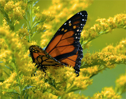
I still find it astounding that monarch butterflies migrate from North America to Mexico. I haven’t tried lying on my back on a lawn and watching for them with binoculars, but I have seen hundreds of them near their food source.  My finding monarchs was a bit like the theme in the Acres-of-Diamonds speech, in which someone goes off to hunt for diamonds. He perishes, after which someone else discovers diamonds in the very field he’d sold to go on his fruitless hunt: I first looked for over-wintering monarchs in Pacific Grove, California, but it was to no avail even though I was there in late November.

Now I realize that I might have been looking right at the monarchs without seeing them. If they’re on an evergreen, they’re somewhat easier to see than when they’re on a tree with broader leaves. With their wings closed, at a glance they can be mistaken for leaves themselves. Someone who doesn’t know what to look for will be fooled; I didn’t know. To be generous to myself, this first fruitless search preceded the availability of detailed maps and descriptions on the Internet.

Then, by chance, a few years later I learned that on their way south, the migrating monarchs gather in Cape May, New Jersey and in other locations on the edge of the Delaware Bay to fatten up on plentiful goldenrod. (I’m sure they feasted on marsh milkweed when it bloomed). I was astonished. monarchs, not across the continent, but only an hour’s drive from my home!  Had my parents known about this, we would have been there every year.

Since learning that the monarchs gather at East Point Lighthouse, I’ve joined other eco-tourists to look for them. Driving on the road to where I expect to find the monarchs, I’ll see dozens of butterflies fluttering over the marshes. Several will cling to one full-blooming goldenrod.  That’s in a good year.

Years ago when I found only one or two, I didn’t know whether I’d come too early or too late, whether the few monarchs I saw were also arriving early, or if they were poor stragglers. Now a few clicks at the computer yields the migration schedule, maps, and sightings.

On the trees, the monarch’s wings are closed. Although we think of the monarch’s orange, their closed wings — tan and lined with a white-speckled black border — look like leaves. When the sun strikes them, they flutter their wings, sometimes rising from the tree before settling down again. When new butterflies arrive, they flutter, hovering, as though looking for the best branch. I arrive in the late afternoon, by which time they’ve begun to gather on the trees.

One year when I couldn’t find the butterflies, I went to a group of houses about half a mile down the road. An older woman stood outside her house on the Delaware Bay. I thought I might be too late; the previous night we’d had a cold snap, but asked anyway.

“I’m looking for the butterflies,” I said after a moment’s greeting.

“You missed them,” she said, “They left yesterday.”

I imagined thousands of orange wings in the sunlight flying out over the gray blue bay.

Maybe some day I’ll watch the monarchs leave. Until then, I’ll be content with my annual pilgrimage to watch them gather by the thousands at the lighthouse. And, God willing, I’ll look again for bluets in the spring.

Why? I don’t want to miss anything, not one blessed thing. In that way I’m like the kid who won’t nap, won’t go to bed, and then — heavy-lidded, trying to stay awake — falls asleep anyway, safe in her parent’s arms. • 23 September 2010

EmailTwitterFacebookDigg

A hand glides across a packed bookshelf, dismissing countless volumes in mere blinks. Then, a single cover arrests its journey. That brief halt—the moment a potential reader truly notices—is the crucible.
Romance novel cover art either triumphs with dazzling success or fades into silent oblivion right then.
Consider the sheer scale: American romance publishing brings in more than $1.4 billion each year. And within this colossal market, a book's cover artwork stands as the paramount arbiter of its fate; it decides if a title is plucked from the shelf or simply ignored.
What follows unpacks the calculated design elements, mind-bending psychological tenets, and accepted industry benchmarks. These elements elevate romance novel covers from simple pretty pictures into potent engines of income.
Author, publisher, or graphic artist: grasp this. Forging truly captivating romance cover images directly shapes how readily books are found, what readers anticipate, and the ultimate tally of books sold.
Why Cover Art for Romance Novels Demands Strategic Design
Romance novel cover imagery follows distinct visual codes compared to other literary categories.
This happens because romance enthusiasts base their purchasing choices on particular visual hints. For example, Lauren Landish books comes with unique cover arts and edge colors and design tailored to her romance book genre. These cues hint at the story's overall feel, its level of intimacy, and the emotional journey promised within.
Unlike thrillers, which often underscore enigma, or literary fiction, which champions artistic expression, romance novel covers absolutely must convey genre expectations in fractions of a second.
The typical reader devotes a mere 1.5 to 3 seconds to examine a book cover before choosing whether to delve deeper. In digital marketplaces like Amazon, where thousands of romance titles vie for attention, that viewing window shrinks even more.
Publishers who pour resources into expert romance novel cover designs experience click-through rates from search results that are 20-40% higher than those with generic or shoddy covers. Such outcomes directly translate into algorithmic favoritism for books showing greater reader interaction.
Furthermore, a romance novel's cover cultivates reader confidence.
A skillfully wrought cover proclaims that the publisher or author treats the work with earnestness. This impression often corresponds with a heightened sense of the book's worth—irrespective of the actual manuscript's caliber.
Conversely, clumsy or poorly executed romance novel covers spark immediate doubt, leading prospective readers to assume the narrative itself is equally inferior.
The Psychology of Color in Romance Book Cover Design
The hues chosen for romance novel covers are not merely for decoration; they convey messages.
Distinct color schemes impart specific romance subgenre signals and emotional atmospheres to seasoned romance readers, who navigate this genre with a keen visual discernment.
Red holds sway over passionate, contemporary, and erotic romance. Around 65% of contemporary romance covers showcase red as a dominant hue, frequently paired with lustrous metals such as gold or silver. Red communicates fervor, longing, and immediate emotional stakes. Yet, plain red alone can feel common. The most potent romance novel cover art deploys red in refined pairings—think deep burgundy alongside blush tones, or spirited red accented by navy.
Soft pastels—blush, lavender, cream—point to sweet romance, new adult tales, or lighthearted contemporary narratives. These gentle shades lessen visual intensity and hint at emotional accessibility. Romance novel covers aimed at readers preferring emotional closeness over overt physical descriptions reliably feature pastel backdrops with illustrated or soft-focus visuals.
Deep jewel tones—emerald, sapphire, amethyst—set the stage for historical romance, paranormal stories, or darker modern accounts. These colors suggest opulence, riddle, and sophistication. Publishers creating romance novel cover art in historical or paranormal categories deliberately select jewel-toned palettes precisely because readers have learned to link these colors with those subgenres.
Gold and silver metallics express opulence and premium standing. When incorporated as accent colors or within the lettering on romance novel covers, metallics elevate a book's perceived worth. They entice readers seeking escape and aspirational tales. Metallic elements also boost clarity in thumbnail previews where digital vendors display books.
Typography: How Fonts Communicate Romance Subgenre
The selected typeface for romance novel covers acts as a genre indicator, every bit as significant as color psychology. Serif fonts—particularly elegant, sweeping serif varieties—grace 58% of historical and paranormal romance covers. They evoke classic romantic traditions and literary authenticity. Such fonts tell readers the story values emotional profundity and narrative complexity.
Contemporary and new adult romance often leans heavily on modern sans-serif fonts, frequently presenting geometric exactness or amicable rounded letterforms. This style of lettering in romance novel cover art proclaims approachability, relatability, and current-day settings. Specifically, rounded sans-serif fonts often hint at youthful main characters or emotionally frank stories.
Script and handwritten-style fonts frequently grace romance novel covers, but their presentation demands precision. When poorly executed, script fonts appear amateurish and hinder readability. Expert romance novel cover designs employ script fonts sparingly—typically for subtitles or secondary text—matched with robust sans-serif fonts for the main title. This preserves visual hierarchy and ensures clarity across all viewing dimensions.
The dimensions of type on romance novel covers absolutely must account for legibility in thumbnail views. A book cover appearing splendid at 8x10 inches may become indecipherable when shown as a 1-inch square on a mobile phone.
The most effective romance novel cover art positions the title in letters ample enough to remain clear when scaled down to 150 pixels, ensuring its discovery across all digital storefronts.
Imagery Choices That Define Romance Book Cover Performance
Romance novel cover art utilizes three main visual strategies: illustrated figures, photographic models, and abstract/textural backdrops. Each brings distinct advantages and cultivated reader anticipation.
Illustrated cover art for romance novels provides a creative malleability and an emotional vividness that photography simply cannot match. Illustrated covers dominate paranormal, fantasy, and historical romance realms. This is because illustration can portray supernatural elements, period-appropriate attire, and fantastical environments with complete artistic mastery. Top-tier illustration runs between $1,500 and $5,000, yet it yields singular visual distinction in crowded categories.
Photographic cover art for romance novels, showcasing model photography, holds sway over contemporary, erotic, and new adult romance categories. Approximately 72% of contemporary romance covers feature human models. Professional model photography expresses immediacy and genuine feeling. However, stock photography—which many independent authors adopt to reduce expenses—betrays an amateur production when the same models surface on numerous books, or when photographic quality falls short of professional benchmarks. Investing in bespoke photography or high-grade stock specifically licensed for book covers profoundly alters the perceived quality of the book.
Abstract and textural backgrounds in cover art for romance novels craft visual refinement while keeping production costs down. Gradient fields, watercolor effects, and textural components can cost considerably less than model photography or custom illustration, all while retaining a polished look. This method proves especially apt for contemporary romance, women's fiction, and emotional romance, where the emphasis rests on lettering and atmosphere rather than visualizing characters.
Strategic Positioning of Elements in Cover Art for Romance Novels
Expert romance novel cover designs adhere to particular compositional guidelines. These guidelines amplify visual resonance and uphold genre recognition. The title's placement occupies the upper 60% of the cover, guaranteeing it remains evident when books are lined up spine-out. The author's name appears conspicuously, yet subservient to the title, typically resting in the upper corners or the lower third.
Focal points in romance novel cover art—be they faces, embracing forms, or central imagery—reside in the center-right spot about 60% of the time. This placement mirrors reading tendencies, where eyes naturally drift toward the cover's right side. The most potent romance novel cover art arranges imagery to forge a visual flow from the focal point toward the title, guiding a viewer's gaze along a deliberate trajectory.
Taglines and series details show up in the lower 20% of romance novel cover art. Series branding—including the series title and book number—has become crucial for discovery, as digital algorithms increasingly discern series-related queries. Uniform visual branding across a series of romance novel covers heightens reader familiarity and bolsters series visibility in retailer recommendations.
Genre-Specific Design Standards for Romance Book Covers
Contemporary romance cover art spotlights relatability through clean lettering, vivid backgrounds, and often presents close-up faces or intimate couple images. Minimalist design proves effective in this realm because contemporary romance readers prize authentic emotion over visual embellishment.
Historical romance cover art for romance novels weaves in period-appropriate attire details, classical color schemes, and frequently showcases illustrated figures or carefully styled photography. Decorative design elements—flourishes, ornate borders, vintage typefaces—proclaim historical settings and warrant the premium pricing that historical romance readers anticipate.
Paranormal and fantasy romance cover art for romance novels embraces otherworldly imagery, dramatic lighting, and often features non-human characters or magical components. These covers generally employ darker color palettes and more intricate illustration than other romance subgenres, thereby conveying the expansive worldbuilding and fantastical elements readers expect.
New adult romance cover art bridges the gap between contemporary and paranormal aesthetics, typically displaying young adult-appearing characters in lively poses. These covers often blend softer color palettes and type styles that communicate intense feeling alongside youthful vigor.
Technical Specifications That Determine Cover Success
Romance novel cover art absolutely must fulfill specific technical demands across numerous retail venues.
Amazon KDP insists on a minimum resolution of 300 DPI and particular file measurements: 2,560 x 1,600 pixels for prime viewing.
IngramSpark, which channels books to thousands of stores, mandates a 1/8 inch bleed on all sides to compensate for printing inconsistencies.
Uniform file formatting guarantees that romance novel cover art appears consistently across various sellers. PNG format, with its embedded color profiles, keeps colors true. In contrast, JPEG compression can instigate subtle color shifts, disrupting visual hierarchy.
The divergence between expert color management and haphazard file conversion directly influences how romance novel cover art registers with prospective readers.
Thumbnail optimization stands as a vital technical consideration for romance novel cover art. When scaled to 150x225 pixels (Amazon's standard for mobile display), tiny text becomes unreadable, and delicate color variations vanish.
Scrutinizing romance novel cover art at actual display sizes across devices prior to publication prevents the discovery of legibility failures post-launch.
Practical Implementation: Creating Professional Cover Art for Romance Novels
Authors and publishers weighing custom design against template-based covers ought to gauge their long-term competitive standing. Custom romance novel cover art, ranging from $300 to $2,000, delivers uniqueness and a professional sheen that broadcasts serious publishing intent.
Template-based covers, at $25-150, however, risk looking too much like competitors' books, possibly hindering their discovery.
Collaborating with seasoned designers necessitates clear dialogue regarding genre norms. Supplying sample covers—instances of successful romance novel cover art in your specific subgenre—aids designers in grasping reader expectations and market benchmarks.
The most effective designer briefs outline: primary and secondary colors, the visual approach (illustration, photography, abstract), the desired mood of the typography, and any needs for series continuity.
Testing romance novel cover art before its release dramatically improves outcomes. Presenting mockups in romance reader circles and soliciting feedback reveals whether your cover genuinely conveys its intended genre signals to your actual target readership. This informal vetting catches any discord between authorial aim and reader perception well before investment in printing or permanent digital placement.
Key Takeaways
Professional romance novel cover art balances aesthetic allure with calculated genre communication. It employs color psychology, font hierarchy, and imagery choices to signal precise subgenres and emotional assurances to readers making rapid purchasing decisions. The technical specifications, compositional standards, and psychological principles discussed above elevate romance novel covers from mere decorative elements into powerful, conversion-focused marketing tools. These tools directly affect a book's visibility, its perceived excellence, and its ultimate sales figures.
Regardless of whether one commissions bespoke designs or opts for templates, prioritizing cover quality broadcasts a commitment to professional publishing benchmarks.
Romance readers discern this dedication and reward it with ongoing engagement and enthusiastic recommendations.

§