Winter on the Salt Marsh

Alone in a light and dark place.

§

in Archive

EmailTwitterFacebookDigg

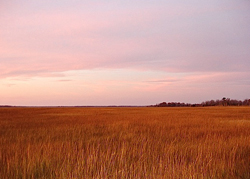
Unlike Thoreau, I could not be removed from the ruckus of civilization. No, I could escape for an hour or two at the most, taking advantage of an unexpected return of warm weather to spend some time in a tidal salt marsh. I write this to return to a place where the most regular sounds are the rustle and whisper of the dry reeds and grasses in the late afternoon breeze.


And then birds. Circling, the gulls cry. In this slant of light their white sides glow golden before they plunge out of sight to settle in a hidden channel of water flowing through the high grass of the meadows. Unseen, a sparrow chips at the afternoon.  A loud croak announces the presence of a nearby great blue heron, disturbed. Snow geese will winter here and add their clamor to the mix.

But now it is quiet.

I am alien to the marsh. The sound of my own breath annoys me, so I try to breathe more shallowly. It doesn’t work. Instead of concentrating on the light as it glazes the grasses and listening for the occasional chip of the sparrow, I find myself thinking about how I can regulate my breath. And, just as bad, after some time, I take a deep breath and sigh.

Thoreau heard a distant train whistle. Here, no nearby railway intrudes; instead, an airplane’s mechanical whine slices its way into the quiet. The contrail tracks the course of the plane and dissolves. In a while it will vanish. If I had the right cell phone app, I’d be able to hold the phone up and find out where the plane came from and where it’s headed. I don’t need it. I already know all I care to about the plane. It’s far away and going farther.

Seen from this distance, in the late afternoon the woods turn violet at the edge of the autumn gold of the meadows. Above the tree line the sky is the palest peach and mauve. The disturbance in the air just above that tree line isn’t an anomalous tower of rounded clouds among the few streaks of white — it’s a column of steam rising from the nuclear power plant. When the wind changes, the column vanishes, and I wonder if I imagined seeing it. I keep checking every few minutes, like poking an old wound to see if it’s still sensitive. Later the steam returns, unmistakable, rising on the horizon, a ghostly reminder of quotidian need.

The goldenrod, on which not so long ago the monarchs fed, has gone to seed. Along with asters, they were among the last wildflowers in bloom. Solidago, as botanists — and florists — call goldenrod, isn’t the hay fever villain of its reputation; it’s just more obvious than the most likely source of irritation, the less-showy ragweed. Anyway, it would be no threat now. By late November, its seeds and white fluff replaced the yellow flowers and maintained the forms of the plumes, no less attractive — and far more fragile.

If I return at the right time, I could see them take sail on the wind. I can spot only a few goldenrod at the edge of a thick stand of common reeds, Phragmites australis.

Like goldenrod, milkweed is associated with monarch butterflies, milkweed being a host plant; however, the butterflies were long gone when I passed a roadside patch of milkweed, their brown seedpods split wide, spilling floss-borne seeds. A gust shook the milkweed, and for a moment the air filled with a white flurry.

To sleep on a pillow stuffed with milkweed floss would be to have sweet dreams.

This is the time of the afternoon when on even the hottest days, a breeze arrives from nowhere to stir the leaves, a promise of relief from the heat. In the dog days, the leaves’ trembling is welcome. Besides, then the darkness will not come for hours, and, when I’m lucky, in the last of the light I’ll find the slow rising net of fireflies as they float from the lawn in the gathering dusk.

In the late afternoon the marsh grasses of the meadows change from gold to an apricot that darkens in places to russet. I wait for the certain arrival of a Maxfield Parrish dusk, when much of the light will have drained from the sky. Then, during those moments of perfect balance, it seems that the earth has absorbed light all day long and, luminous, returns it to the evening air. As the shadows lengthen and the marsh salt grass begins to glow, a chill arrives on the wind, and I know the unseasonable warmth is almost at an end.

The sunsets here are like giveaway calendar photography: an almost tawdry display. Lines of hot pink clouds float above the horizon and in the stream. Hot pink. Fuchsia. Cerise. Scarlet. I haven’t mastered the trick of watching a sunset without staring at the sun, and when I look away, an aqua spot floats in my field of vision.

I’m surprised when I turn around and find that at my back the clouds still reflect the sunset. The sky is what my mother used to call sky-blue-pink, which only seems like an impossibility: Pink clouds dissolve in the blue sky, and the sky becomes simultaneously pink and blue.

Earlier in the day I’d seen six wild swans “drift on the still water/ Mysterious, beautiful…” like Yeats’  “nine and fifty” at Coole. One pair raised their wings, reminding me both of the swan boats of the Boston Public Garden Lagoon and Swan Lake. Driving home, I pass the body of water where swans had been swimming.

I couldn’t find the swans. On one side of the road where they had been swimming, the water was still high. On the other the tide had gone out leaving little water. The remaining water was host to the blue sky and pink clouds that lay huddled in the pools as though seeking refuge from the oncoming dark.

Sometimes the oncoming dark hurtles toward me, and other times it approaches with the steady direction and speed of an inbound subway train.

December is tricky.

I hate December’s short days as I scuttle home in the dark like a beetle into its burrow. The sooner December 21 arrives, the sooner the days will begin to lengthen again.

My task is to learn how to anticipate, to look forward to something without wishing away time. Wishing away time is a lesser suicide: to wish away time is to leap onto the tracks. • 8 December 2010

EmailTwitterFacebookDigg

A hand glides across a packed bookshelf, dismissing countless volumes in mere blinks. Then, a single cover arrests its journey. That brief halt—the moment a potential reader truly notices—is the crucible.
Romance novel cover art either triumphs with dazzling success or fades into silent oblivion right then.
Consider the sheer scale: American romance publishing brings in more than $1.4 billion each year. And within this colossal market, a book's cover artwork stands as the paramount arbiter of its fate; it decides if a title is plucked from the shelf or simply ignored.
What follows unpacks the calculated design elements, mind-bending psychological tenets, and accepted industry benchmarks. These elements elevate romance novel covers from simple pretty pictures into potent engines of income.
Author, publisher, or graphic artist: grasp this. Forging truly captivating romance cover images directly shapes how readily books are found, what readers anticipate, and the ultimate tally of books sold.
Why Cover Art for Romance Novels Demands Strategic Design
Romance novel cover imagery follows distinct visual codes compared to other literary categories.
This happens because romance enthusiasts base their purchasing choices on particular visual hints. For example, Lauren Landish books comes with unique cover arts and edge colors and design tailored to her romance book genre. These cues hint at the story's overall feel, its level of intimacy, and the emotional journey promised within.
Unlike thrillers, which often underscore enigma, or literary fiction, which champions artistic expression, romance novel covers absolutely must convey genre expectations in fractions of a second.
The typical reader devotes a mere 1.5 to 3 seconds to examine a book cover before choosing whether to delve deeper. In digital marketplaces like Amazon, where thousands of romance titles vie for attention, that viewing window shrinks even more.
Publishers who pour resources into expert romance novel cover designs experience click-through rates from search results that are 20-40% higher than those with generic or shoddy covers. Such outcomes directly translate into algorithmic favoritism for books showing greater reader interaction.
Furthermore, a romance novel's cover cultivates reader confidence.
A skillfully wrought cover proclaims that the publisher or author treats the work with earnestness. This impression often corresponds with a heightened sense of the book's worth—irrespective of the actual manuscript's caliber.
Conversely, clumsy or poorly executed romance novel covers spark immediate doubt, leading prospective readers to assume the narrative itself is equally inferior.
The Psychology of Color in Romance Book Cover Design
The hues chosen for romance novel covers are not merely for decoration; they convey messages.
Distinct color schemes impart specific romance subgenre signals and emotional atmospheres to seasoned romance readers, who navigate this genre with a keen visual discernment.
Red holds sway over passionate, contemporary, and erotic romance. Around 65% of contemporary romance covers showcase red as a dominant hue, frequently paired with lustrous metals such as gold or silver. Red communicates fervor, longing, and immediate emotional stakes. Yet, plain red alone can feel common. The most potent romance novel cover art deploys red in refined pairings—think deep burgundy alongside blush tones, or spirited red accented by navy.
Soft pastels—blush, lavender, cream—point to sweet romance, new adult tales, or lighthearted contemporary narratives. These gentle shades lessen visual intensity and hint at emotional accessibility. Romance novel covers aimed at readers preferring emotional closeness over overt physical descriptions reliably feature pastel backdrops with illustrated or soft-focus visuals.
Deep jewel tones—emerald, sapphire, amethyst—set the stage for historical romance, paranormal stories, or darker modern accounts. These colors suggest opulence, riddle, and sophistication. Publishers creating romance novel cover art in historical or paranormal categories deliberately select jewel-toned palettes precisely because readers have learned to link these colors with those subgenres.
Gold and silver metallics express opulence and premium standing. When incorporated as accent colors or within the lettering on romance novel covers, metallics elevate a book's perceived worth. They entice readers seeking escape and aspirational tales. Metallic elements also boost clarity in thumbnail previews where digital vendors display books.
Typography: How Fonts Communicate Romance Subgenre
The selected typeface for romance novel covers acts as a genre indicator, every bit as significant as color psychology. Serif fonts—particularly elegant, sweeping serif varieties—grace 58% of historical and paranormal romance covers. They evoke classic romantic traditions and literary authenticity. Such fonts tell readers the story values emotional profundity and narrative complexity.
Contemporary and new adult romance often leans heavily on modern sans-serif fonts, frequently presenting geometric exactness or amicable rounded letterforms. This style of lettering in romance novel cover art proclaims approachability, relatability, and current-day settings. Specifically, rounded sans-serif fonts often hint at youthful main characters or emotionally frank stories.
Script and handwritten-style fonts frequently grace romance novel covers, but their presentation demands precision. When poorly executed, script fonts appear amateurish and hinder readability. Expert romance novel cover designs employ script fonts sparingly—typically for subtitles or secondary text—matched with robust sans-serif fonts for the main title. This preserves visual hierarchy and ensures clarity across all viewing dimensions.
The dimensions of type on romance novel covers absolutely must account for legibility in thumbnail views. A book cover appearing splendid at 8x10 inches may become indecipherable when shown as a 1-inch square on a mobile phone.
The most effective romance novel cover art positions the title in letters ample enough to remain clear when scaled down to 150 pixels, ensuring its discovery across all digital storefronts.
Imagery Choices That Define Romance Book Cover Performance
Romance novel cover art utilizes three main visual strategies: illustrated figures, photographic models, and abstract/textural backdrops. Each brings distinct advantages and cultivated reader anticipation.
Illustrated cover art for romance novels provides a creative malleability and an emotional vividness that photography simply cannot match. Illustrated covers dominate paranormal, fantasy, and historical romance realms. This is because illustration can portray supernatural elements, period-appropriate attire, and fantastical environments with complete artistic mastery. Top-tier illustration runs between $1,500 and $5,000, yet it yields singular visual distinction in crowded categories.
Photographic cover art for romance novels, showcasing model photography, holds sway over contemporary, erotic, and new adult romance categories. Approximately 72% of contemporary romance covers feature human models. Professional model photography expresses immediacy and genuine feeling. However, stock photography—which many independent authors adopt to reduce expenses—betrays an amateur production when the same models surface on numerous books, or when photographic quality falls short of professional benchmarks. Investing in bespoke photography or high-grade stock specifically licensed for book covers profoundly alters the perceived quality of the book.
Abstract and textural backgrounds in cover art for romance novels craft visual refinement while keeping production costs down. Gradient fields, watercolor effects, and textural components can cost considerably less than model photography or custom illustration, all while retaining a polished look. This method proves especially apt for contemporary romance, women's fiction, and emotional romance, where the emphasis rests on lettering and atmosphere rather than visualizing characters.
Strategic Positioning of Elements in Cover Art for Romance Novels
Expert romance novel cover designs adhere to particular compositional guidelines. These guidelines amplify visual resonance and uphold genre recognition. The title's placement occupies the upper 60% of the cover, guaranteeing it remains evident when books are lined up spine-out. The author's name appears conspicuously, yet subservient to the title, typically resting in the upper corners or the lower third.
Focal points in romance novel cover art—be they faces, embracing forms, or central imagery—reside in the center-right spot about 60% of the time. This placement mirrors reading tendencies, where eyes naturally drift toward the cover's right side. The most potent romance novel cover art arranges imagery to forge a visual flow from the focal point toward the title, guiding a viewer's gaze along a deliberate trajectory.
Taglines and series details show up in the lower 20% of romance novel cover art. Series branding—including the series title and book number—has become crucial for discovery, as digital algorithms increasingly discern series-related queries. Uniform visual branding across a series of romance novel covers heightens reader familiarity and bolsters series visibility in retailer recommendations.
Genre-Specific Design Standards for Romance Book Covers
Contemporary romance cover art spotlights relatability through clean lettering, vivid backgrounds, and often presents close-up faces or intimate couple images. Minimalist design proves effective in this realm because contemporary romance readers prize authentic emotion over visual embellishment.
Historical romance cover art for romance novels weaves in period-appropriate attire details, classical color schemes, and frequently showcases illustrated figures or carefully styled photography. Decorative design elements—flourishes, ornate borders, vintage typefaces—proclaim historical settings and warrant the premium pricing that historical romance readers anticipate.
Paranormal and fantasy romance cover art for romance novels embraces otherworldly imagery, dramatic lighting, and often features non-human characters or magical components. These covers generally employ darker color palettes and more intricate illustration than other romance subgenres, thereby conveying the expansive worldbuilding and fantastical elements readers expect.
New adult romance cover art bridges the gap between contemporary and paranormal aesthetics, typically displaying young adult-appearing characters in lively poses. These covers often blend softer color palettes and type styles that communicate intense feeling alongside youthful vigor.
Technical Specifications That Determine Cover Success
Romance novel cover art absolutely must fulfill specific technical demands across numerous retail venues.
Amazon KDP insists on a minimum resolution of 300 DPI and particular file measurements: 2,560 x 1,600 pixels for prime viewing.
IngramSpark, which channels books to thousands of stores, mandates a 1/8 inch bleed on all sides to compensate for printing inconsistencies.
Uniform file formatting guarantees that romance novel cover art appears consistently across various sellers. PNG format, with its embedded color profiles, keeps colors true. In contrast, JPEG compression can instigate subtle color shifts, disrupting visual hierarchy.
The divergence between expert color management and haphazard file conversion directly influences how romance novel cover art registers with prospective readers.
Thumbnail optimization stands as a vital technical consideration for romance novel cover art. When scaled to 150x225 pixels (Amazon's standard for mobile display), tiny text becomes unreadable, and delicate color variations vanish.
Scrutinizing romance novel cover art at actual display sizes across devices prior to publication prevents the discovery of legibility failures post-launch.
Practical Implementation: Creating Professional Cover Art for Romance Novels
Authors and publishers weighing custom design against template-based covers ought to gauge their long-term competitive standing. Custom romance novel cover art, ranging from $300 to $2,000, delivers uniqueness and a professional sheen that broadcasts serious publishing intent.
Template-based covers, at $25-150, however, risk looking too much like competitors' books, possibly hindering their discovery.
Collaborating with seasoned designers necessitates clear dialogue regarding genre norms. Supplying sample covers—instances of successful romance novel cover art in your specific subgenre—aids designers in grasping reader expectations and market benchmarks.
The most effective designer briefs outline: primary and secondary colors, the visual approach (illustration, photography, abstract), the desired mood of the typography, and any needs for series continuity.
Testing romance novel cover art before its release dramatically improves outcomes. Presenting mockups in romance reader circles and soliciting feedback reveals whether your cover genuinely conveys its intended genre signals to your actual target readership. This informal vetting catches any discord between authorial aim and reader perception well before investment in printing or permanent digital placement.
Key Takeaways
Professional romance novel cover art balances aesthetic allure with calculated genre communication. It employs color psychology, font hierarchy, and imagery choices to signal precise subgenres and emotional assurances to readers making rapid purchasing decisions. The technical specifications, compositional standards, and psychological principles discussed above elevate romance novel covers from mere decorative elements into powerful, conversion-focused marketing tools. These tools directly affect a book's visibility, its perceived excellence, and its ultimate sales figures.
Regardless of whether one commissions bespoke designs or opts for templates, prioritizing cover quality broadcasts a commitment to professional publishing benchmarks.
Romance readers discern this dedication and reward it with ongoing engagement and enthusiastic recommendations.

§